In this simple tutorial, I’m going to guide you in implementing simple tabs in your Home Assistant dashboard, which will hold individual cards. This how-to is based on the Tabbed Card by dev kinghat, which is available in HACS.
The aim and purpose of this custom card is to tidy up your dashboard viewport, easily organize your devices per room or per entity type and use it to navigate seamlessly between tabs.
Whos this for?
This neat little custom card is very handy for grouping your Home Assistant entities within a single view and cycle through them by clicking the appropriate tabs. Further, you can pair it with the Lovelace swipe card and swipe through them on a mobile/tabled dashboard.
It may sound to you this card is aimed at beginners, and you may think Home Assistant already has tabs (Views) on top of the dashboard. Well, even if you are a power user you will find use for it, as certain entities can be stacked in tabs for easier reachability. I will show you how this is useful through a few examples.
Installation
HACS
The Tabbed Card is available in HACS (Home Assistant Community Store).
- Open HACS
- Click + Explore and Download Repositories
- Under Frontend, search for Tabbed Card
- Select the latest version
- Click on Download
- Click to Reload your resources
- If you are using Lovelace in storage mode, add a resource reference:
resources:
  - url: /local/decluttering-card/decluttering-card.js
    type: module
Manual
- Download tabbed-card.js from the Github Repo
- Place the .js file in <config directory>/www/tabbed-card/tabbed-card.js
- Add the resource reference
- Restart Home Assistant
Usage
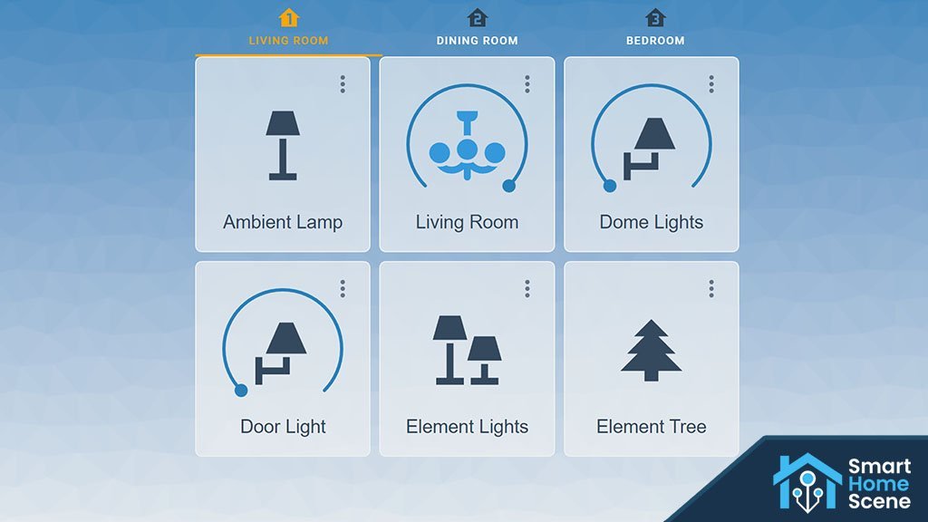
Lets say you have a bunch of smart lights in your home and you want to organize them by room. You want them showing within your viewport only when needed, not cluttering your view. Maybe you want to add a few different entities serving different purposes on a specific tab.
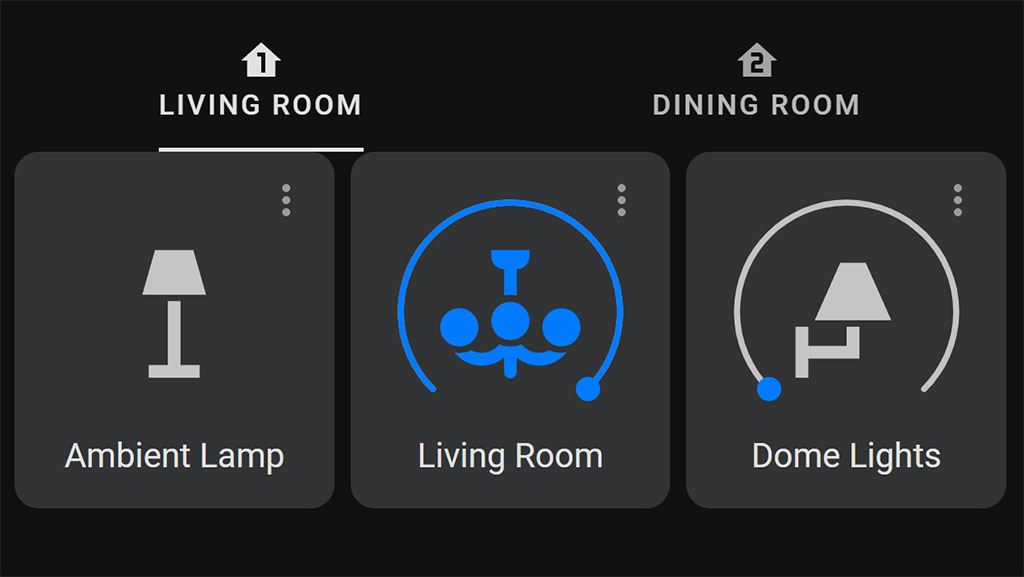
For this example, I will create a horizontal stack of cards nested within a vertical stack of cards each nested within it’s own tab:
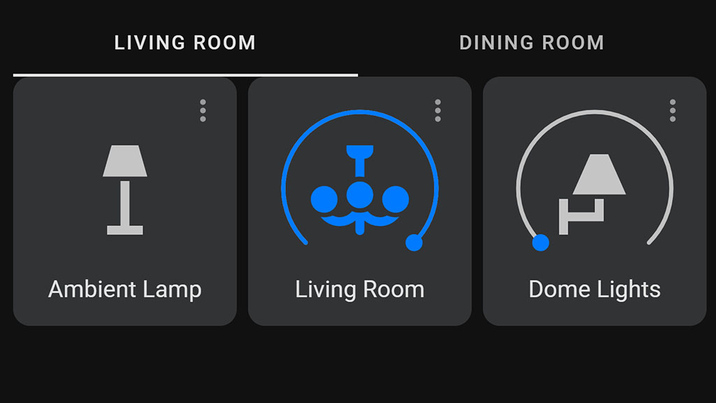
type: custom:tabbed-card
tabs:
- attributes:
label: Living Room
card:
type: vertical-stack
cards:
- type: horizontal-stack
cards:
- type: light
entity: light.living_room_lamp
- type: light
entity: light.living_room
- type: light
entity: light.dome_lights
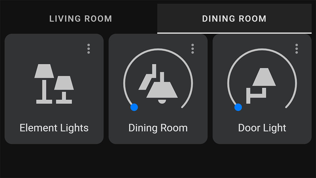
- attributes:
label: Dining Room
card:
type: vertical-stack
cards:
- type: horizontal-stack
cards:
- type: light
entity: light.element_lights
- type: light
entity: light.dining_room
- type: light
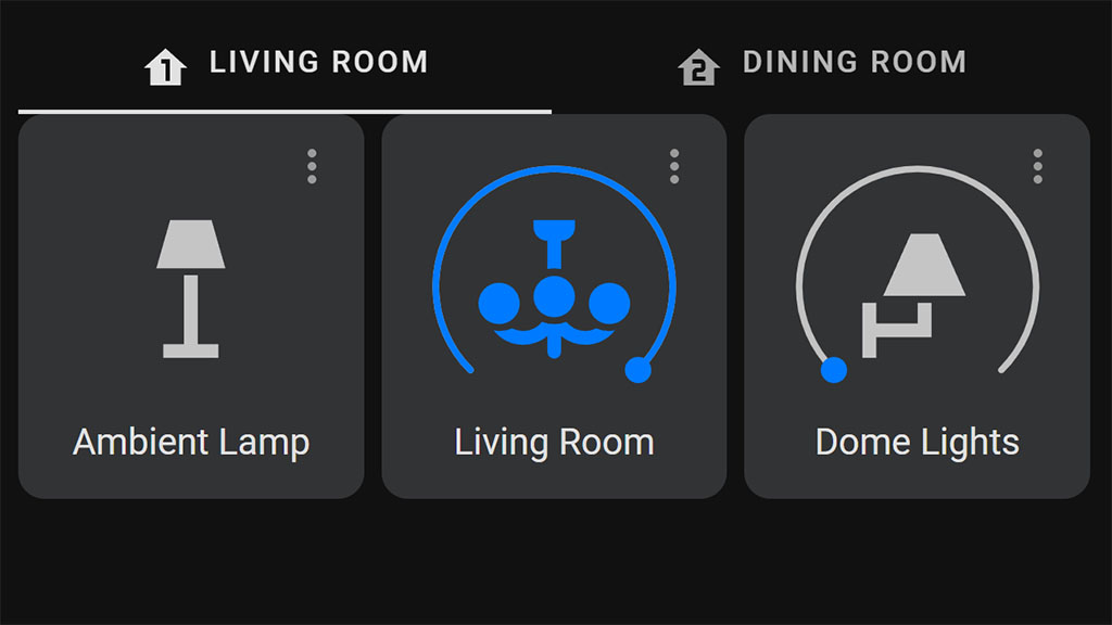
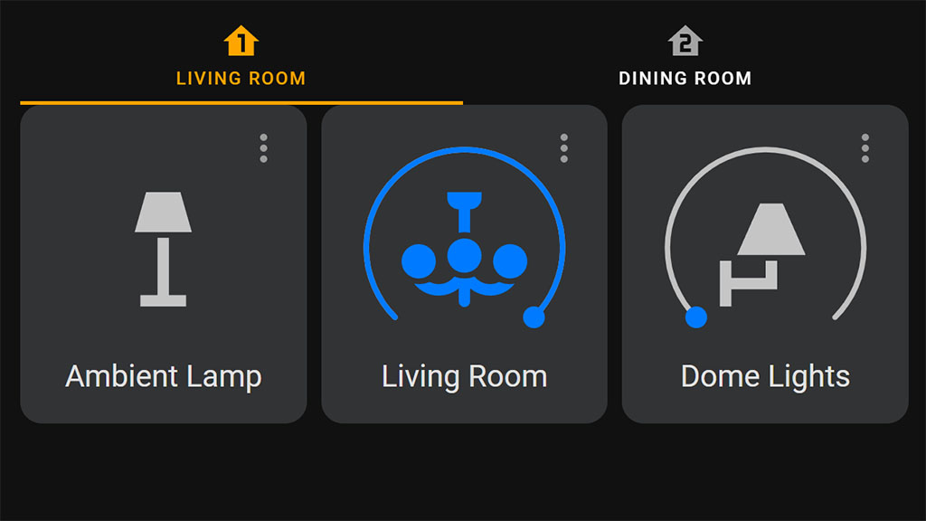
entity: light.door_lightThis example simply shows the tab layout of the card. We can tweak some variables of the Tabbed card, to make it more appealing. For example, we can add icons to the labels, shrink the indicator to be the width of the label or stacked the icon on top the label:
type: custom:tabbed-card
tabs:
  - attributes:
      label: Living Room
      icon: mdi:home-floor-1
      isMinWidthIndicator: true
      stacked: true
    card:
      type: vertical-stack
      cards:
      .....
  - attributes:
      label: Dining Room
      icon: mdi:home-floor-2
      isMinWidthIndicator: true
      stacked: true
    card:
      type: vertical-stack
      cards:
      .....
Further, we can use the isFadingIndicator variable to make the selected tab animation fade in and out instead of sliding right and left. The minWidth can be used to shrink the tab as narrow as possible without causing text to wrap. To hide the label, we can add an empty string “” to the label: variable. To set the default tab, we can use the defaultTabIndex variable:
type: custom:tabbed-card
options:
  defaultTabIndex: 1 #0 is the first tab index, the second tab 1, third 2, forth 3...
tabs: ...
Styling
Some general variables can be changed to make the Tabbed Card more visually pleasing. We can change the font size, color of the tab, color of the inactive tab, height, padding and stacked height of the tab. Here’s a list of all the variables you can tweak:
To change each variable’s value, we add it under the styles parent object. For example, if we want to change the color and decrease the font size and height:
type: custom:tabbed-card
styles:
  '--mdc-theme-primary': orange
  '--mdc-tab-text-label-color-default': white
  '--mdc-typography-button-font-size': 10px
  '--mdc-tab-stacked-height': 55px
tabs:
 .....
As a second example, lets assume you some kind of heating entity and thermostat combo that you wish to control and overview within a single viewport. We can split all the information our entities provide and show them in individual tabs:
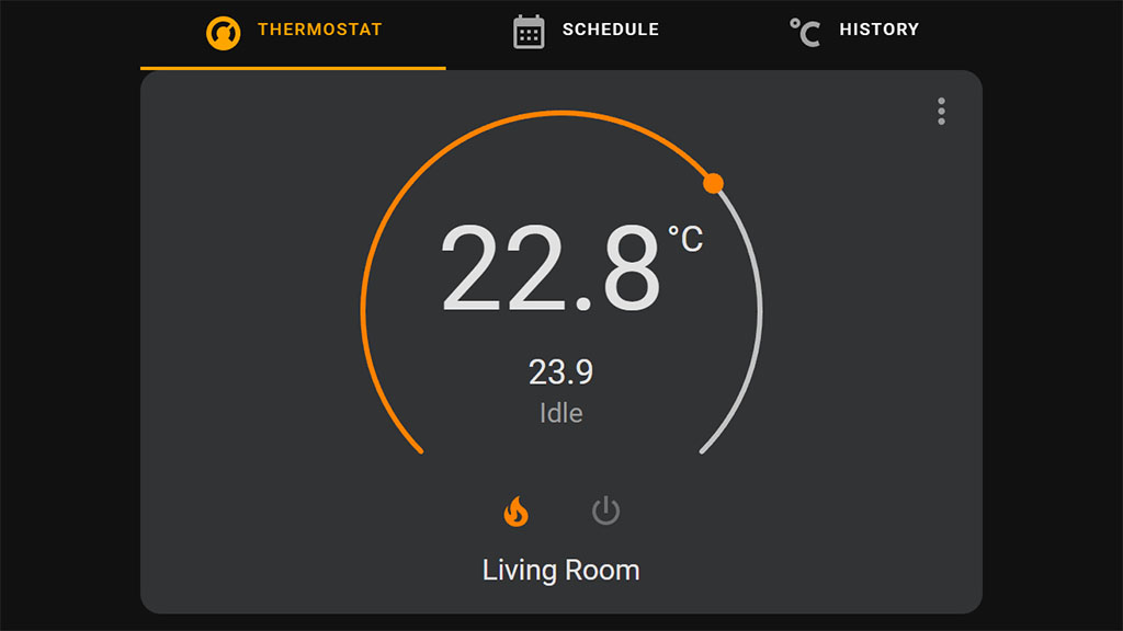
type: custom:tabbed-card
styles:
'--mdc-theme-primary': orange
'--mdc-tab-text-label-color-default': white
'--mdc-typography-button-font-size': 10px
tabs:
- attributes:
label: Thermostat
icon: mdi:thermostat
card:
type: thermostat
entity: climate.living_room
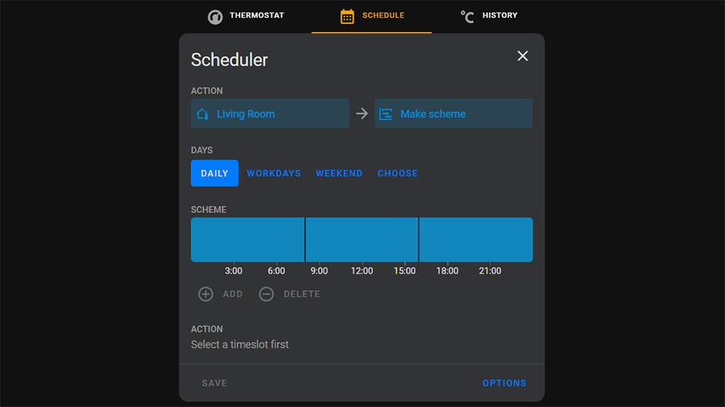
- attributes:
label: Schedule
icon: mdi:calendar-month
card:
type: custom:scheduler-card
include:
- climate.living_room
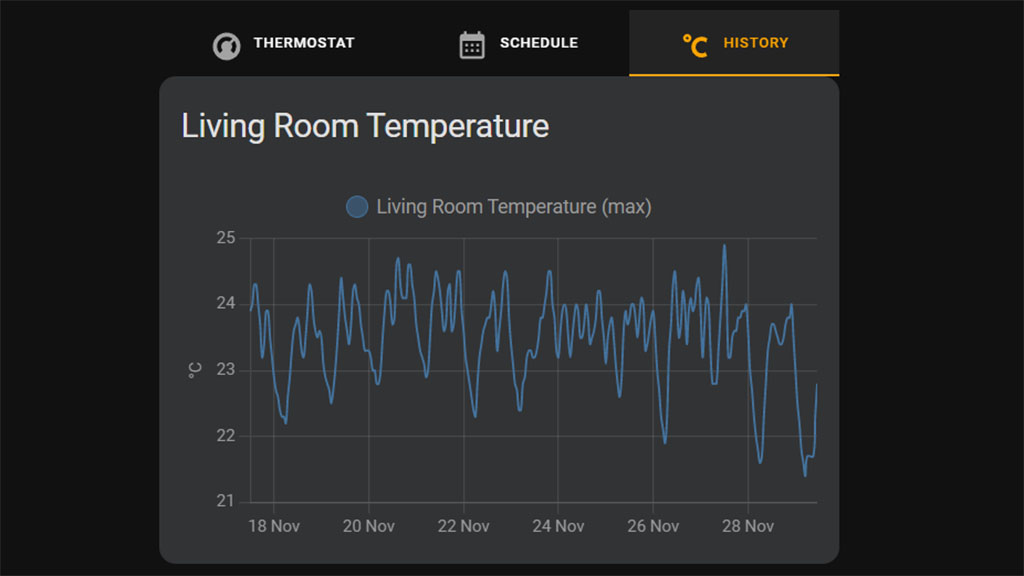
- attributes:
label: History
icon: mdi:temperature-celsius
card:
type: statistics-graph
chart_type: line
period: hour
days_to_show: 24
entities:
- sensor.living_room_temperature
stat_types:
- max
title: Living Room TemperatureNote: The schedule is handled by the custom Scheduler card and Component by dev nielsfaber.
Summary
The Tabbed Card is a pretty neat and simple way of organizing your dashboard into tabs. This can be very useful for people who have many devices integrated in Home Assistant or for those who tend to over clutter their views. There are other ways to achieve what Tabbed Card does, but this is very beginner friendly and simple. If you are familiar with card-mod, you can use it to further tweak the Tabbed Card by adding the appropriate CSS variables.
Just some ideas for organizing things into tabs:
- General Room Layout
- 1st Tab: Living Room (lights, motion sensors, locks)
- 2nd Tab: Kitchen (lights, motion sensors, led strips)
- 3rd Tab: Hallway (lights, locks, cameras)
- Per Room Layout (eg. Living Room)
- 1st Tab: Lights
- 2nd Tab: Motion Sensors, Security Devices
- 3rd Tab: Media Player Entities
- Heating Layout
- 1st Tab: Thermostat
- 2nd Tab: Schedule
- 3rd Tab: History or logbook
- System Overview Layout
- 1st Tab: Processor and Ram Usage
- 2nd Tab: Storage
- 3rd Tab: Uptime and Power


How do you make it to switch tab when swiped with swipe card? Any example where to put the swipe card code at?
Hello Roy,
You need to place the Tabbed Card code within the swipe card, for example:
- type: custom:swipe-cardcards:
- type: custom:tabbed-card
tabs:
- attributes:
label: Living Room
card:
type: vertical-stack
cards:
- type: horizontal-stack
cards:
- type: light
entity: light.living_room_lamp
- type: light
entity: light.living_room
- type: light
entity: light.dome_lights
- attributes:
label: Dining Room
.....
You can configure the swipe-card parameters as you wish, from here:
https://github.com/bramkragten/swipe-card#parameters
Cheers
Hi!
I would really like to implement the swipe card but for me it doesnt work like you did in your code example. Do you have any idea, why?
hi,
how can I implement cover entities?
type: custom:tabbed-cardtabs:
- attributes:
label: Living Room
card:
type: vertical-stack
cards:
- type: horizontal-stack
cards:
- type: cover
entity: cover.porta_finestra_cucina_curtain
i got: Unknown type encountered: cover
type: cover is not a valid card.
You either need to use Mushroom’s Cover Card or one of the built in cards.
Cheers