Why use the History Explorer Card?
Recently we talked about optimizing your database and filtering your entities in Home Assistant. While replacing the default SQLite database with MariaDB is a step in the right direction, exploring HA’s database using the default History integration is often slow, laggy and tedious to work with.
Developer alexarch21 created a custom card capable of smoothing out the experience when digging through your HA history. History Explorer Card offers a highly interactive and configurable way to view the history of your entities in HA, using asynchronous stream caching and adaptive data decimation to hide the high latency of HA’s history database. In short, you will be able to display larger amounts of data with significant lag decrease. Further, you can group similar entities in a single chart and lay them on top of each other for comparison purposes.
ApexCharts Card vs History Explorer Card
Readers of our blog may recall a recent tutorial we made about using the ApexCharts Custom Graphing Cards to represent historic data in HA. Those who read the guide, may ask themselves: Why would I need this? Can’t I just use Apex to show historic data from a certain entity? After all, it’s an extremely capable and highly customizable custom card. Well, there are some key differences between the two:
- ApexCharts is used to display data in a static time range
To change time range, you would need to edit the card - History Explorer is used to display data in a dynamic time range
To change time range, you can use the selector on the top or simply drag the chart left or right
This the most important difference between the two custom cards. Even though Apex is the more customizable graphing card of the two, offering a variety of display options, the History Explorer Card can also be customized to a certain degree. Customization is not really the focus of this card.
In summary, ApexCharts is used to display important, select data in a specific time range available at a glance of your dashboard. History Explorer Card is used to dynamically and flexibly analyze historic entity data from the cards user interface. Both support stacking multiple entities within a single chart.
Installation
HACS
The History Explorer Card is available in the Home Assistant Community Store (HACS).
- Open HACS
- Click Frontend
- Click + Explore and download repositories
- Search for “History Explorer Card”
- Click + Download this repository with HACS
- Reload resources
Manual
- Download the history-explorer-card.js file and copy it into your config/www folder
- Add a resource reference to it. On the HA UI, navigate to Configuration -> Dashboards -> Resources. Visit the Registering resources page on the Home Assistant support site for more information.
- Click on the + Add Resource button
- Type /local/history-explorer-card.js into the URL field and make sure the resource type field says Javascript Module
- Hit create
You can now add the card to your dashboard as usual. You may have to refresh the page in your browser once after adding the card to properly initialize it.
Initial Setup
For the purpose of this tutorial, we are going to create a new dashboard with a single Panel view and add a shortcut in the Home Assistant sidebar. We are going to use Panel mode, as it only allows one full screen card displayed in the view, which fits the History Explorer Card’s use case perfectly.
To do this, go to Configuration > Dashboards and click + Add Dashboard. Name your dashboard, set an icon and select the Show in sidebar toggle.
Open your newly created dashboard, click Edit dashboard at the top. Edit the default view and set it to Panel (1 card). Add the History Explorer Card to this single view, and we can get to work.
Usage
The History Explorer Card can be configured interactively through the UI or manually through YAML. The card can contain one or multiple charts, every chart can display the history of one or multiple entities. Currently the card supports line charts for numerical entities and timeline charts for non-numerical ones. The order of the charts displayed, as well as the colors used for charts and timeline states are all fully configurable.
When the card is first added, it displays data for the last 24 hours starting from the current date and time. You can use the date selector in the top left corner to quickly browse through days or the right corner date range selector to zoom in and out of the history. You can zoom in the card range by selecting the magnifying glass icon at the top or use the mouse wheel while holding CTRL.
Click or tap on a graph and drag left or right to slide it through time. The card will stream in the database as you move along. If you have a slow DB (like on an SD card), you may see empty parts on the chart that will progressively fill as the data comes in. The larger the shown time range, the more the effect is visible. Once you release the mouse button after dragging (or release your finger from the chart), the card will automatically readjust the y-axis on all charts to better reflect the new data. The card will also synchronize all other charts in the history to the same point in time. That way you will always see the same time range on all your data and everything will be aligned. To battle slow databases, the History Explorer Card uses Data Decimation for larger time ranges.
Data Decimation
The card will automatically reduce the data shown in the charts and remove details that would not be visible or useful at a given time range. For example, if you view a per-hour history, nothing will be removed and you will be able to explore the raw data, point by point. If you view an entire week at once, there’s no need to show data that changed every few seconds, as you couldn’t even see it. The card will simplify the curves and make the experience a lot faster that way.
This feature can be turned off in the options if you want, either globally or by entity.
Interactive configuration
The interactive configuration on the card itself is pretty easy to figure out. You use the date selectors at the top to configure time range, add entities with the bottom selector and drag the chart right to go back in time. Most of the time, this is all you will ever need.
If you want to manage all your entities dynamically, you will need to supply an empty YAML. By default the UI entity dropdown will list all entities known to HA. This can be a little overwhelming if you have many. To list only the entities you have included in your database for recording, you can filter them with the recordedEntitiesOnly variable:
type: custom:history-explorer-card
recordedEntitiesOnly: true
graphs:
By default, the History Explorer card will show the last 24 hours when first opened. You can define the defaulTimeRange to change it to whatever you want. For line graphs, each dynamically added entity will be displayed in its own graph by default. If you prefer having entities with compatible units of measure grouped into a single graph, then you can override this default behavior by setting combineSameUnits:
type: custom:history-explorer-card
recordedEntitiesOnly: true
defaultTimeRange: 4h #Can be 30m, 2d, 15m, 1w...
combineSameUnits: true
graphs:
If you history contains unavailable states for a given entity, the card will show this as a gap by default in the chart. If you want to remove unavailable states, you can set the showUnavailable: variable to false to make the card hide and interpolate over unavailable states. Displayed data points can be rounded with the rounding (default: 2 decimals) variable:
type: custom:history-explorer-card
recordedEntitiesOnly: true
defaultTimeRange: 4h #Can be 30m, 2d, 15m, 1w...
combineSameUnits: true
showUnavailable: false
rounding: 3
graphs:
Customizing UI Elements
The appearance of the card can be customized and tailored according to your needs. It’s UI elements can be changed by defining the appropriate variable, for example you can toggle dark mode with:
type: custom:history-explorer-card
uimode: dark
To change the colors of the UI elements, you can define the following color variables:
type: custom:history-explorer-card
uiColors:
  gridlines: '#ff000040'
  labels: green
  buttons: darkgreen
  selector: 'rgba(255,255,255,255)'
  closeButton: '#0000001f'
The header of the card can be set by configuring it’s variable:
type: custom:history-explorer-card
header: 'SmartHomeScene.com'
header: ' '   # Using a single space will remove the header and leave some padding space
header: hide  # The hide option will remove the header entirely
Further, the layout of the card can be adjusted and specific elements can be hidden:
type: custom:history-explorer-card
uiLayout:
  toolbar: top #Can be top, bottom, both, hide
  selector: bottom #Can be top, bottom, both, hide
labelsVisible: false
labelAreaWidth: 25
showTooltipColorsLine: false
showTooltipColorsTimeline: false
The position of the entity selector and toolbar can be modified by setting it to top, bottom, both or hide. When setting the value to both, the element will appear at both positions: top and bottom. This is useful when a lot of vertical scrolling is needed.
You can hide the labels by setting labelsVisible to false or define the labelAreaWidth (default is 65). The state color boxes in the tooltips can optionally be hidden for line graphs or timelines (or both) by using showTooltipColorsLine or showTooltipColorsTimeline.
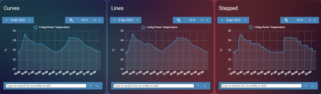
You can change the line display modes for line charts to curves, lines or stepped. The default setting, curves, is the smoothest of the three, while the lines setting connects data points by a line. The stepped simple displays raw, quantized data.
Customize dynamically added entities
In the History Explorer Card, certain settings can be preconfigured so that whenever an entity from a specific domain, device class or state is added it will inherent these variables. For example, you can have all entities from the binary_sensor domain to have their off state colored red. Or all entities from the motion device_class to have their on state colored green. Example for a timeline graph:
type: custom:history-explorer-card
stateColors:
  motion.on: green #Color all sensor from device class 'motion' ON states green
  binary_sensor.off: 'rgb(255,0,0)' #Color all binary sensors OFF states red
  off: 	'#800080' #Color all entities OFF states purple
Whenever an entity is added via the UI that falls in one of these categories, it will follow these preconfigured variables. You can follow the same logic to preset variables for line graphs as well:
type: custom:history-explorer-card
entityOptions:
  humidity: #Color all humidity charts with these preset values
    color: blue
    fill: steelblue
    ymin: 20
    ymax: 100
    lineMode: lines
  sensor.living_room_temperature: #Color this specific entity with these preset values
    color: red
    fill: orangered
    ymin: 15
    ymax: 27
    width: 2
Besides setting the color and fill of the cart, the Y-Axis can be preconfigured for specific entities. By default, the card automatically generates the Y-axis min and max values from the recorded data, but in some case it will be useful to have it predefined.
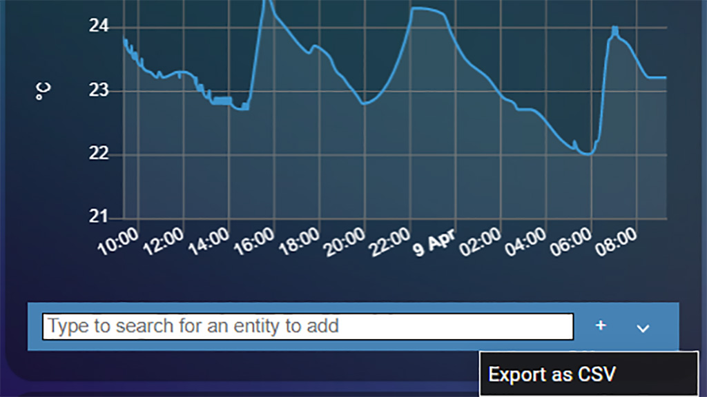
Exporting Data
The History Explorer Card has a very useful feature which allows you to export data as CSV file. This file can be further used to analyze patterns, compare trends and be imported in a more powerful data examination tool, such as Microsoft Excel. To export data, use the dropdown menu at the selector tool at the bottom of the card:
Creating Static Charts
At the beginning of this article, we mentioned the ApexCharts Card as a powerful static data display graphing card. We noted it differs from the History Explorer card as it’s main focus is creating static charts over a preset time range.
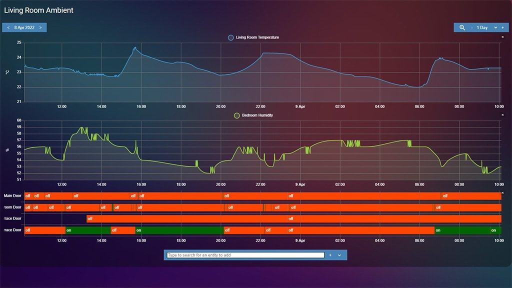
Even though The History Explorer cards main feature is dynamically exploring recorded history, it is also capable of creating default static charts to be viewed when first opening your dashboard. We will show a few examples of how you can configure presets for specific entities:
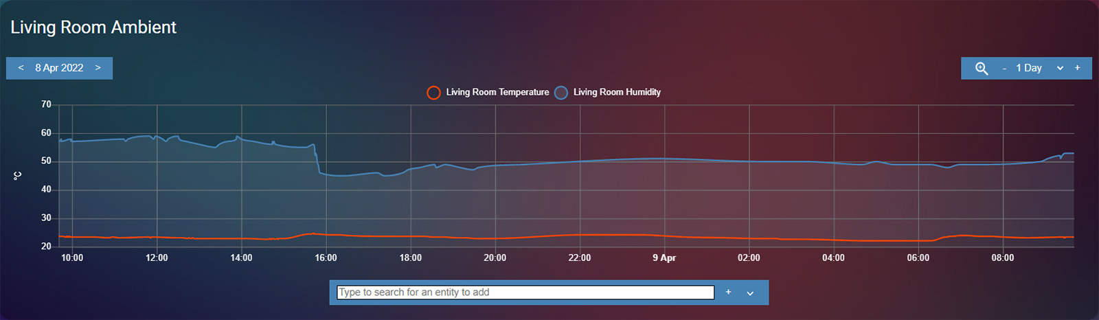
type: custom:history-explorer-card
header: Living Room Ambient
showUnavailable: false
defaultTimeRange: 24h
decimation: true
uiColors:
  gridlines: dimgray
  labels: white
  buttons: steelblue
  selector: rgba(255,255,255,255)
  closeButton: '#0000001f'
graphs:
  - type: line
    entities:
      - entity: sensor.living_room_temperature
        color: orangered
      - entity: sensor.living_room_humidity
        color: steelblue
        fill: rgba(151,187,205,0.15)

type: custom:history-explorer-card
header: Raspberry Pi 4 Status
showUnavailable: false
defaultTimeRange: 24h
decimation: true
uiColors:
  gridlines: dimgray
  labels: white
  buttons: orangered
  selector: rgba(255,255,255,255)
  closeButton: '#0000001f'
graphs:
  - type: line
    entities:
      - entity: sensor.processor_temperature
        color: orangered
        fill: rgba(255,69,0,0.15)
      - entity: sensor.processor_use_percent
        color: steelblue
        fill: rgba(151,187,205,0.15)
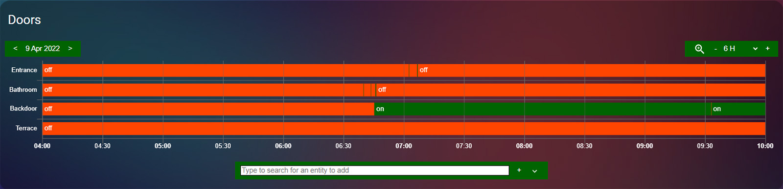
type: custom:history-explorer-card
header: Doors
defaultTimeRange: 6h
uiColors:
  gridlines: dimgray
  labels: white
  buttons: darkgreen
  selector: rgba(255,255,255,255)
  closeButton: '#0000001f'
stateColors:
  binary_sensor.on: darkgreen
  binary_sensor.off: orangered
graphs:
  - type: timeline
    entities:
      - entity: binary_sensor.main_door
        name: Entrance
      - entity: binary_sensor.bathroom_door
        name: Bathroom
      - entity: binary_sensor.backdoor
        name: Backdoor
      - entity: binary_sensor.terrace_door
        name: Terrace
Summary
History Explorer Card is a powerful tool for digging into your Home Assistant recorder history. You can scroll through time right from your dashboard or export a CSV file for a more advanced data analysis. By using some advanced techniques, such as asynchronous stream caching and adaptive data decimation, the default lag and delay of the SQL database is nullified.
You can also create a default, static time range card for viewing history at a glance on your dashboard. Even if a static date or time range is set, you still scroll back in time without having to change the card configuration.


Can we use this and record 1 year of HA device data or does this still only allow us to see the usual 2 weeks of data that HA normally keeps?