True Home Assistant tinkerers are always looking for ways to up their dashboard game. Dev Sian-Lee-SA created a cool Honeycomb Menu which pop ups when defined as an action in any card. It presents a hexagonal shaped menu which you can style to your liking and use as a quick action toggle for many things. It’s pretty good looking, slick and has great usability for a mounted wall tablet. Whether this scratches that dashboard itch is up for you to decide, Let’s see how it works!
Installation
HACS
The Honeycomb Menu is available in the Home Assistant Community Store (HACS).
- Open HACS
- Click Frontend
- Click + Explore and download repositories
- Search for “honeycomb”
- Click + Download this repository with HACS
- Reload resources
Manual
- Download the honeycomb-menu.js file and copy it into your config/www folder
- Add a resource reference to it. On the HA UI, navigate to Configuration -> Dashboards -> Resources. Visit the Registering resources page on the Home Assistant support site for more information.
- Click on the + Add Resource button
- Type /local/honeycomb-menu.js into the URL field and make sure the resource type field says Javascript Module
- Hit create
IMPORTANT: Thomas Loven’s card-tools are a requirement for the Honeycomb Module. Make sure you install this module as well, manually or from HACS.
KEEP IN MIND: Honeycomb Module uses a modified system of button-card‘s templating system. It is also built with this card as a base, so it works best when used together. Some variables honeycomb pulls directly from button-card so a little different configuration is needed when using other cards as a base. Templates to reduce clutter are also usable only when defined for button-card.
How to Use
Like in any of our tutorials, we are going to show you how this Honeycomb module works through examples and provide the YAML code for each one, for easy copy-paste. We will try to cover a wide scope of use cases which hopefully will give you some ideas for using Honeycomb. A little bit of info:
- Honeycomb Menu is a module, not a card
- A base card need to be created, and honeycomb executed as a call-service
- A call-service can be executed in many ways in HA, but in this tutorial we are going to use actions defined in cards
- We’re going to base our design on Mushroom Cards (see tutorials: Part 1, Part 2)
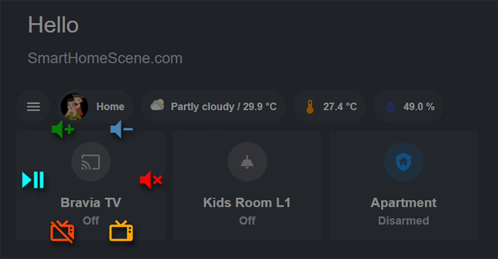
Creating a base card
For the purpose of this tutorial, we will use simple cards and just define actions for them. Let’s create a simple horizontal stack of three Mushroom cards: entity, light & alarm card.
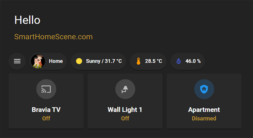
Now, to execute the Honeycomb menu, we will define the following actions:
- tap_action: Honeycomb menu for quick controlling our entity (Bravia TV)
- hold_action: Honeycomb menu for various light entity settings (Wall Light 1)
- tap_action: Honeycomb menu for controlling our alarm entity (Apartment)
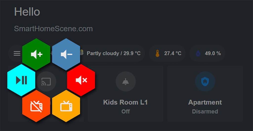
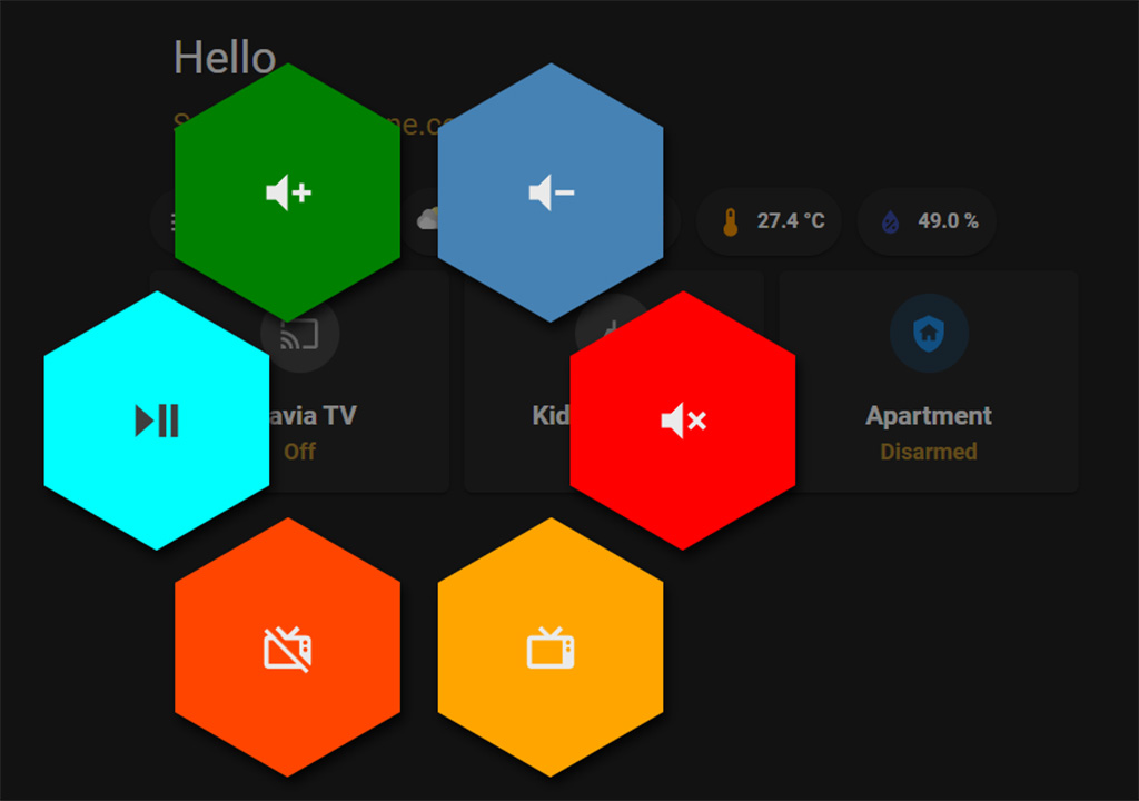
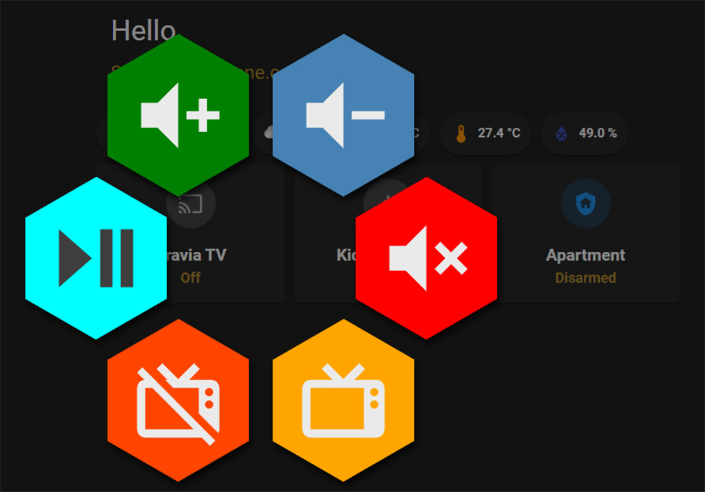
Example 1: Simple TV Remote
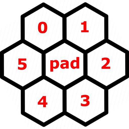
To construct a Honeycomb menu, we define buttons as a variable. Each of these buttons is a separate hex on the Honeycomb and a total of 6 (0-5) can be defined. We will define simple actions for each button and look into styling and more complex configuration as we go through the tutorial.
To define the separate buttons, first we need to set the honeycomb service call for our entity:
type: custom:mushroom-entity-card
entity: media_player.bravia_tv
layout: vertical
tap_action:
  action: call-service
  service: honeycomb
.....
If you tap your card without buttons defined, you will notice honeycomb pops up empty. This means the service call is working and we can continue. To define the buttons, we will simply create a list of icons, which will initially position each button in the Honeycomb:
type: custom:mushroom-entity-card
entity: media_player.bravia_tv
layout: vertical
hold_action:
  action: toggle
tap_action:
  action: call-service
  service: honeycomb
  service_data:
    buttons:
      - icon: mdi:volume-plus #0
      - icon: mdi:volume-minus #1
      - icon: mdi:volume-mute #2
      - icon: mdi:television-classic #3
      - icon: mdi:television-classic-off #4
      - icon: mdi:play-pause #5
Now, when you click your entity TV card a full Honeycomb menu will appear. You will notice your buttons are positioned in order like you defined them, starting with 0.
The middle button or pad is used to control things such as light brightness, opening or closing shutters, covers and much more. It can travel horizontally (X), vertically (Y) or in both directions (XY). We will look into the pad a bit later.
Depending on your theme, you may notice the buttons have transparent backgrounds, which we can style and colorize afterwards. For now, we will focus on the button actions themselves.
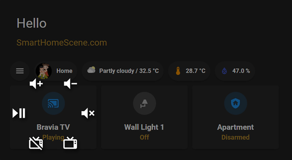
We can define simple actions to these buttons we created and test them out. The icons themselves are already self-explanatory, so we just need to execute the appropriate service call for each. Example:
type: custom:mushroom-entity-card
entity: media_player.bravia_tv
layout: vertical
hold_action:
  action: toggle
tap_action:
  action: call-service
  service: honeycomb
  service_data:
    buttons:
      - icon: mdi:volume-plus
        tap_action:
          action: call-service
          service: media_player.volume_down #Volume down
          service_data:
            entity_id: media_player.bravia_tv
      - icon: mdi:volume-minus
        tap_action:
          action: call-service
          service: media_player.volume_up #Volume up
          service_data:
            entity_id: media_player.bravia_tv
      - icon: mdi:volume-mute
        tap_action:
          action: call-service
          service: media_player.turn_mute #Mute
          service_data:
            entity_id: media_player.bravia_tv
      - icon: mdi:television-classic
        tap_action:
          action: call-service
          service: media_player.turn_on #Turn ON tv
          service_data:
            entity_id: media_player.bravia_tv
      - icon: mdi:television-classic-off
        tap_action:
          action: call-service
          service: media_player.turn_off #Turn OFF tv
          service_data:
            entity_id: media_player.bravia_tv
      - icon: mdi:play-pause
        tap_action:
          action: call-service
          service: media_player.media_play_pause #Play/pause
          service_data:
            entity_id: media_player.bravia_tv
This is the simplest way to define Honeycomb buttons. As we go, things are going to become more complex, but this should be no problem for HA enthusiasts.
Example 2: Light Control
Lets assume our light is dimmable and we would like to control it’s brightness as well. We can achieve this using the middle button or pad. Both vertical and horizontal axis can be defined (X & Y). In this guide, we will define only the X. We can assign simple actions to the other buttons, control other entities or skip some buttons all together.
type: custom:mushroom-light-card
layout: vertical
entity: light.kids_room_l1
hold_action:
  action: call-service
  service: honeycomb
  service_data:
    entity: entity
    xy_pad:
      x:
        service: light.turn_on
        service_data:
          entity_id: light.kids_room_l1
          brightness_step_pct: '{{ x_percentage / 5 }}'
    buttons:
      - icon: mdi:lightbulb
        tap_action:
          action: call-service
          service: light.turn_on
          service_data:
            entity_id: light.kids_room_l1
      - icon: mdi:lightbulb-on
        tap_action:
          action: call-service
          service: light.turn_off
          service_data:
            entity_id: light.kids_room_l1
      - show: false
      - icon: mdi:light-flood-down
        tap_action:
          action: call-service
          service: light.turn_on
          service_data:
            entity_id: light.sonoff_terrace
      - icon: mdi:wall-sconce
        tap_action:
          action: call-service
          service: light.turn_on
          service_data:
            entity_id: light.wall_light_2
      - show: false
The position of the X-pad will step brightness up and down depending on our defined brightness_step_pct variable. The further you move the slider, the faster the brightness will change as the X variable is derived from distance of the center calculated in pixels. The same applies for the Y variable (vertical).
Similar services can be setup for hue, saturation, color or for controlling cover entities such as blinds, shutters, fans. We just need to call on the appropriate service. For example:
xy_pad:
  y:
    service: cover.set_cover_position
    service_data:
      entity_id: cover.garage_door
      position: '{{ y_percentage / 10 }}'
xy_pad:
x:
service: fan.increase_speed
service_data:
entity_id: fan.living_room
percentage_step: '{{ x_percentage / 15 }}'With a little bit of styling magic, some icons and scripts positioning and we get this:
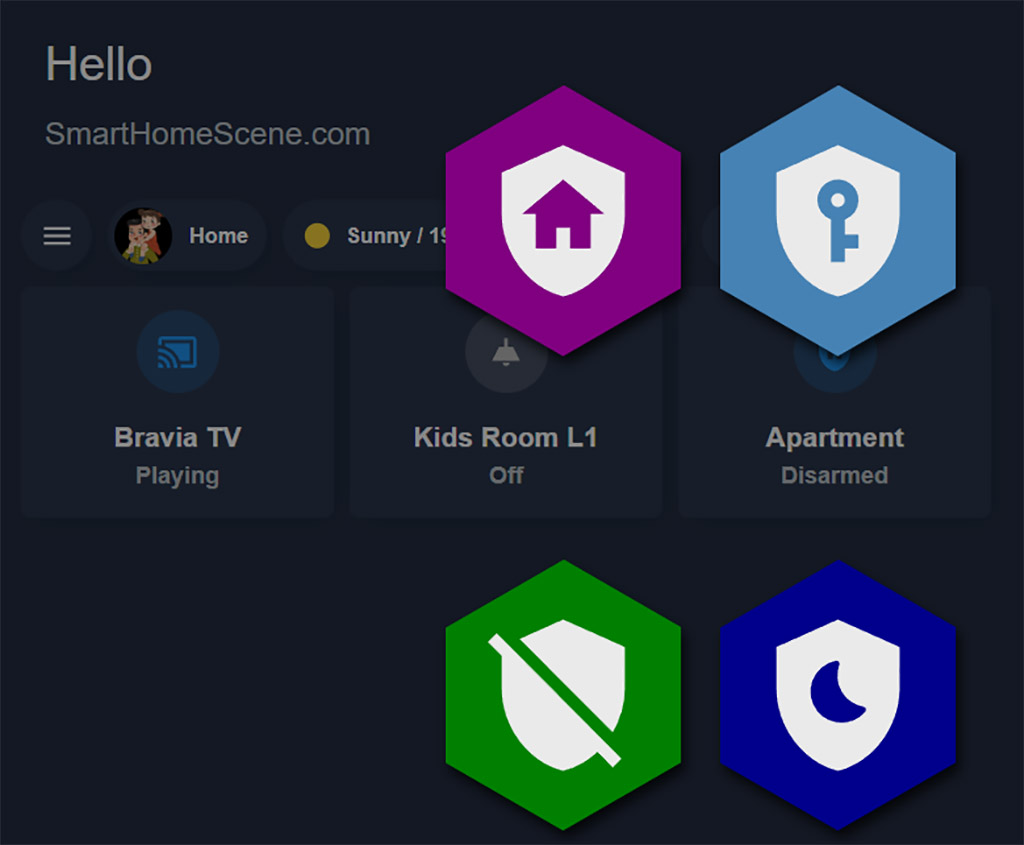
Example 3: Alarm Control
As a third example, we are going to setup an Alarm card with arming and disarming functions. Assuming you already have an alarm system integrated in Home Assistant, we are going to create scripts to execute alarm commands, such as arm home, arm away, disarm. You can read this guide (Alarmo) for setting your very own DIY alarm system.
First, we create a couple of scripts based on the built-in Home Assistant alarm system which we will execute using Honeycomb buttons. Although scripts are not necessary, we will use them here as a way of reducing clutter:
#Arm Home
alarm_arm_home:
  alias: Arm Alarm in Home Mode
  sequence:
    - service: alarm_control_panel.alarm_arm_home
      data:
        code: "1234"
      target:
        entity_id: alarm_control_panel.apartment
  mode: single
#Arm Away
alarm_arm_away:
alias: Arm Alarm in Away Mode
sequence:
- service: alarm_control_panel.alarm_arm_away
data:
code: "1234"
target:
entity_id: alarm_control_panel.apartment
mode: single
#Arm Night
alarm_arm_night:
  alias: Arm Alarm in Night Mode
  sequence:
    - service: alarm_control_panel.alarm_arm_night
      data:
        code: "1234"
      target:
        entity_id: alarm_control_panel.apartment
  mode: single
#Disarm
alarm_disarm:
alias: Disarm Alarm
sequence:
- service: alarm_control_panel.alarm_disarm
data:
code: "1234"
target:
entity_id: alarm_control_panel.apartment
mode: singleNow we add these scripts to our Honeycomb Menu, which will execute the appropriate call service with the click of a button.
type: custom:mushroom-alarm-control-panel-card
entity: alarm_control_panel.apartment
layout: vertical
tap_action:
  action: call-service
  service: honeycomb
  service_data:
    size: 500
    spacing: 10
    buttons:
      - icon: mdi:shield-home
        tap_action:
          action: call-service
          service: script.alarm_arm_home
      - icon: mdi:shield-key
        tap_action:
          action: call-service
          service: script.alarm_arm_away
      - show: false
      - icon: mdi:shield-moon
        tap_action:
          action: call-service
          service: script.alarm_arm_night
      - icon: mdi:shield-off
        tap_action:
          action: call-service
          service: script.alarm_disarm
      - show: false
Like we mentioned, you could call the service directly within the card, but by using a script you will significantly reduce clutter in your YAML. We get something like this as an end result:
Styling
You will notice the Honeycomb in the last example is enlarged and spaced out. There are many variables we can configure to style the Honeycomb Menu. Color, size, spacing and even an audio file can be loaded to play whenever a button has been tapped.
So lets change the color of the honeycombs. If we define color_type: card it will colorize the background of the button. If we define it as color_type: icon it will colorize only the icon.
#Button Color Type
type: custom:mushroom-entity-card
entity: media_player.bravia_tv
layout: vertical
tap_action:
  action: call-service
  service: honeycomb
  service_data:
    buttons:
      - icon: mdi:volume-plus
        color_type: card #or icon
        color: green
      - icon: mdi:volume-minus
        color_type: icon #or card
        color: steelblue
.....
Next, let’s say we want to increase the size of the menu and add some more spacing in between the buttons. We can use the size and spacing variables, both declared in pixels. To match the icon size of our new button size, we need to increase it using the styles variable.
#Honeycomb Size and Spacing
type: custom:mushroom-entity-card
entity: media_player.bravia_tv
layout: vertical
tap_action:
  action: call-service
  service: honeycomb
  service_data:
    size: 500
    spacing: 10
    buttons:
      - icon: mdi:volume-plus
        color_type: card
        color: green
        styles:
          icon:
            - width: 70%
      - icon: mdi:volume-minus
        color_type: card
        color: steelblue
        styles:
          icon:
            - width: 70%
......
We can add audio file to be played whenever a button has been pressed. To do this, upload a sound file to www/media folder (local=www) and than define it in the card:
#Button Audio File
type: custom:mushroom-entity-card
entity: media_player.bravia_tv
layout: vertical
tap_action:
  action: call-service
  service: honeycomb
  service_data:
    size: 500
    spacing: 10
    audio: /local/media/pin-drop.ogg
    buttons:
      - icon: mdi:volume-plus
        color_type: card
        color: green
.....
Further, we can set some default values by editing our theme. Whatever layout you create later, will inherent these values. You will need to manually override them if you want to change them to something else. Add these lines to your theme.yaml file.
styles {
    --honeycomb-menu-icon-color: var(--paper-item-icon-color);
    --honeycomb-menu-icon-active-color: var(--paper-item-icon-active-color);
    --honeycomb-menu-background-color: var(--paper-card-background-color);
    --honeycomb-menu-active-background-color: var(--paper-card-active-background-color, var(--paper-card-background-color));
    --honeycomb-menu-disabled: #9a9a9a6e
}
Templates
Templates can be defined for the Honeycomb Menu to minimize clutter, offer reusability and keep things neat and consistent. We can do this by creating a template for button-card, as they only work with this card as a base. To do this, we create a template under the button_card_templates: variable in the raw configuration editor of our dashboard.
Let’s say we are defining a template for lights, as they tend to be repetitive in their function and configuration. We define every variable we want: color, size, type, buttons, actions, entities and we place it above everything else in the configuration editor:
#Honeycomb Template defined in button-card
button_card_templates:
  light_honeycomb:
    entity: light.kids_room_l1
    hold_action:
      action: call-service
      service: honeycomb
      service_data:
        entity: entity
        xy_pad:
          x:
            service: light.turn_on
            service_data:
              entity_id: light.kids_room_l1
              brightness_step_pct: '{{ x_percentage / 5 }}'
        buttons:
          - icon: mdi:lightbulb
            color_type: card
            color: green
            styles:
              icon:
                - width: 70%
            tap_action:
              action: call-service
              service: light.turn_on
              service_data:
                entity_id: light.kids_room_l1
          - icon: mdi:lightbulb-on
            color_type: card
            color: steelblue
            styles:
              icon:
                - width: 70%
            tap_action:
              action: call-service
              service: light.turn_off
              service_data:
                entity_id: light.kids_room_l1
          - show: false
          - icon: mdi:light-flood-down
            color_type: card
            color: red
            styles:
              icon:
                - width: 70%
            tap_action:
              action: call-service
              service: light.turn_on
              service_data:
                entity_id: light.sonoff_terrace
          - icon: mdi:wall-sconce
            color_type: card
            color: orange
            styles:
              icon:
                - width: 70%
            tap_action:
              action: call-service
              service: light.turn_on
              service_data:
                entity_id: light.wall_light_2
          - show: false
title: Home
views:
  - title: Home
    path: home
.....
Entities can remain undefined, or replaced later when adding the card. Than we simply set the template in our new card and replace the dynamic content e.g. the new light we want to inherit these attributes:
type: custom:button-card
template: light_honeycomb
entity: light.bar_lights
The honeycomb menu will display the same button configuration without further setup. This significantly reduces clutter and makes reusability easy.
Summary
These are the basic principles and configuration variables of the Honeycomb Menu. When templating is involved, there is almost no limit to what can be achieved. Paired with the versatility of the custom:button-card you can customize your dashboard however you like.
In this tutorial, we used Mushroom Cards as a base, to show you that Honeycomb works with any card whose actions can be defined. In reality, we do not even need a card to popup the module. The call-service can be called upon by many things in Home Assistant, such as timers, MQTT events, input helpers and much more.
All use cases and example are too much for a single tutorial, but if you have questions and need help please leave a comment, we are happy to help.


hi, can i ask you, what is this for a theme?
https://smarthomescene.com/wp-content/uploads/2022/08/honeycomb-base-card.jpg.webp
Hey,
This is the slate theme by dev seangreen2.
https://github.com/seangreen2/slate_theme
Cheers
how did you style the xy slider portion?
Hey,
The honeycomb menu uses button-card’s styling schema. So, you can add the variable styles: under the xy_pad: variable and add some styling.
Cheers
Everything works perfectly for me, except (may be to simple to see it), I do not find the way to create the initial button calling the service like shown in the github tutorial. That is to say, an hexagon button with 3D push effect and transparency…
In fact I try to create a similar set of honey button like top left in the demonstration video of sian-Lee (https://www.youtube.com/watch?v=MCNxgb0mrSA)… I should be too stupid…
Do I have to use a dedicated picture? I would like to play also with it’s transparency.
If you can illuminate my mind 😉