Our Mushroom Cards Tutorial covered the initial card types of this awesome Home Assistant card collection and guided you in creating your clean and minimalistic Lovelace UI. The dev piitaya has been hard at work since, pushing updates constantly, providing bug fixes and adding new card types.
In this tutorial, we are going to talk about the new card types, see how you can create a room layout and further style the dashboard.
New Card Types
Since our tutorial on the 5th of March, the dev released 5 new card types in the Mushroom Card collection for Home Assistant:
- Update Card
- Vacuum Card
- Media Card
- Lock Card
- Humidifier Card
- Climate Card
Update Card
Simple update card, used to display available updates and control an update entity.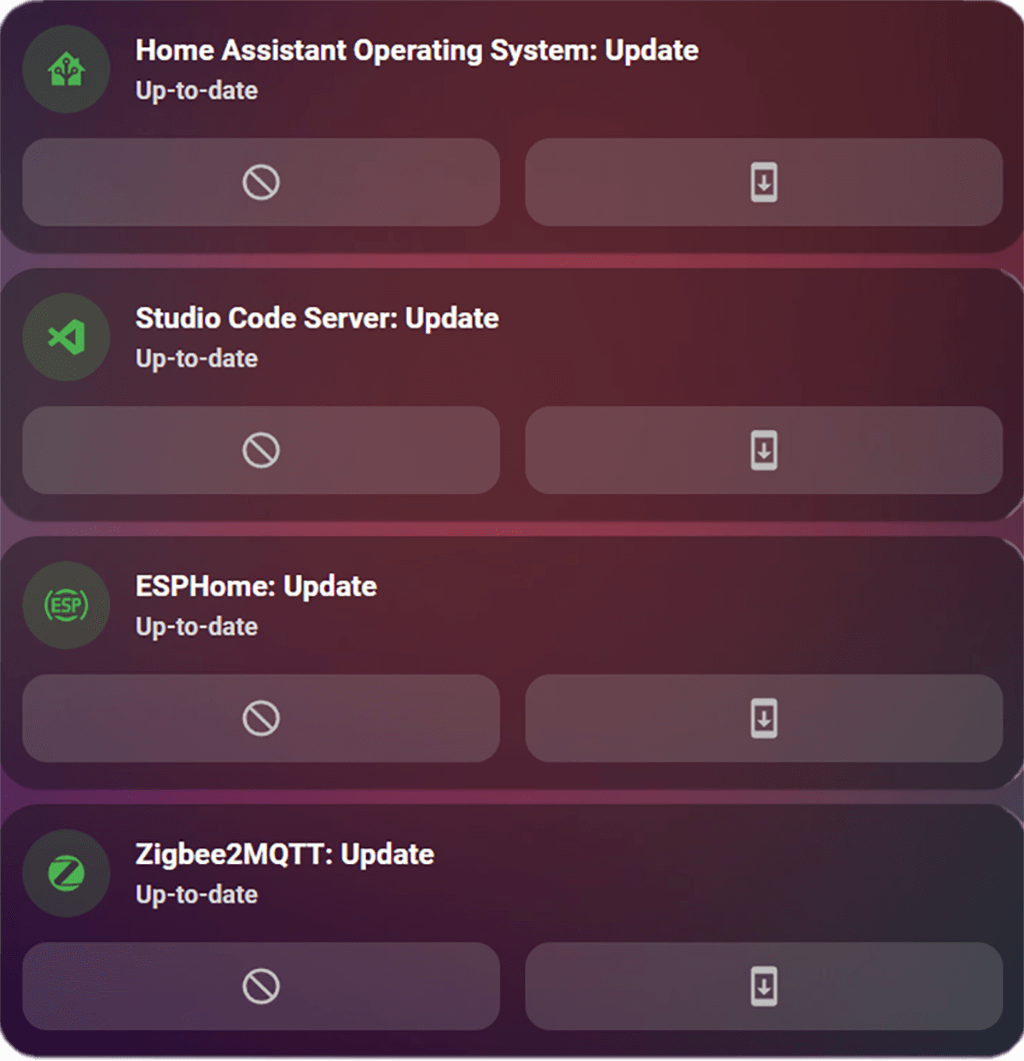
type: vertical-stack
cards:
  - type: custom:mushroom-update-card
    entity: update.home_assistant_operating_system_update
    show_buttons_control: true
    icon: mdi:home-assistant
  - type: custom:mushroom-update-card
    entity: update.studio_code_server_update
    show_buttons_control: true
    icon: mdi:microsoft-visual-studio-code
  - type: custom:mushroom-update-card
    entity: update.esphome_update
    show_buttons_control: true
    icon: mdi:car-esp
  - type: custom:mushroom-update-card
    entity: update.zigbee2mqtt_update
    show_buttons_control: true
    icon: mdi:zigbee
Vacuum Card
With this card, you can quick-control your vacuum cleaner. This does not contain a native map, but a few controls which fit nicely with the design of Mushroom cards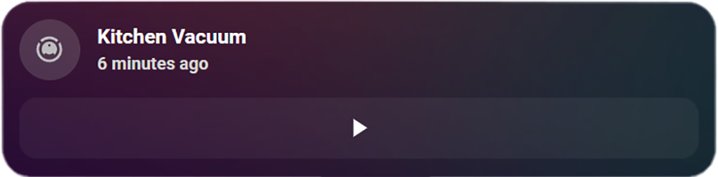
type: custom:mushroom-vacuum-card
entity: vacuum.living_room_vacuum
name: Kitchen Vacuum
secondary_info: last-changed
commands:
  - start_pause
Media Card
The Media card allows you to control your smart speaker or any media_player entity with a few layout options.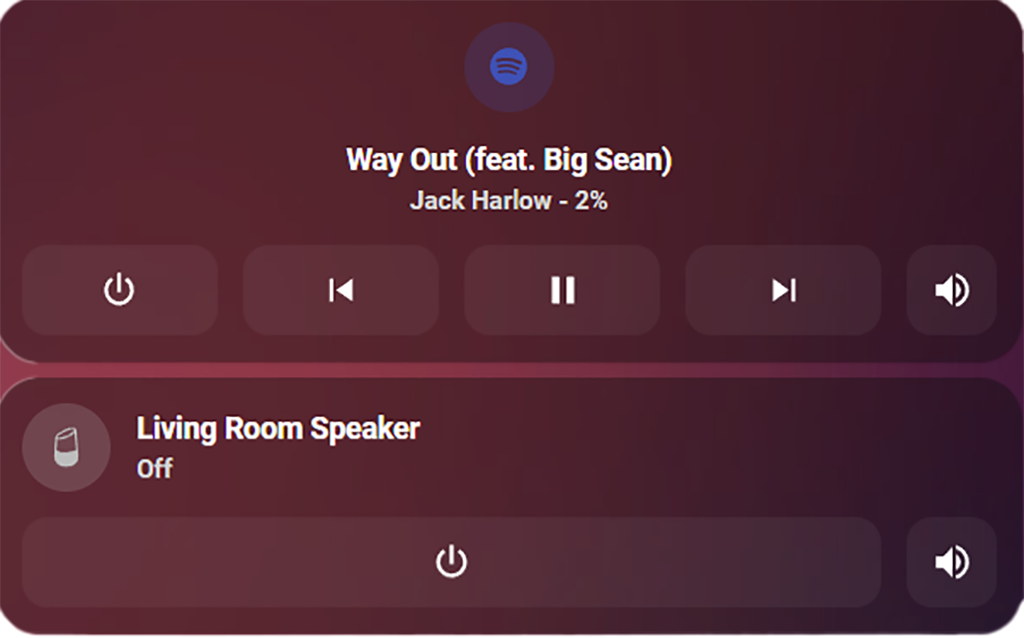
type: custom:mushroom-media-player-card
entity: media_player.kitchen_speaker
use_media_info: true
media_controls:
  - on_off
  - previous
  - play_pause_stop
  - next
volume_controls:
  - volume_set
show_volume_level: true
layout: vertical
Lock Card
Used to control your house locks, security locks, smart plug software locks. Any lock entity can be added to this card.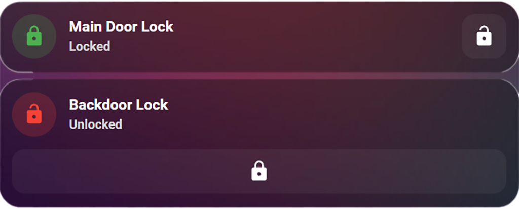
type: custom:mushroom-lock-card
entity: lock.main_door
name: Main Door Lock
layout: horizontal
Humidifier Card
You can control your ambient humidity with this native Humidifier card.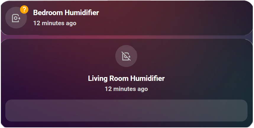
type: custom:mushroom-humidifier-card
entity: humidifier.bedroom
layout: horizontal
secondary_info: last-changed
show_target_humidity_control: true
collapsible_controls: true
name: Bedroom Humidifier
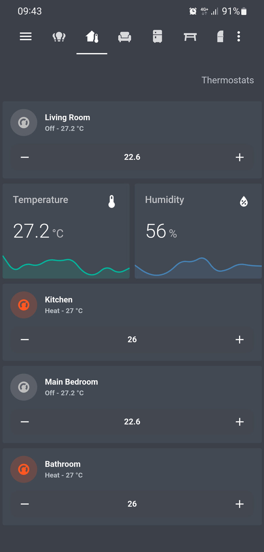
Climate Card
The final card released by the dev in the Mushroom Collection is the Climate Card. You can easily control your thermostat and thus your ambient temperature.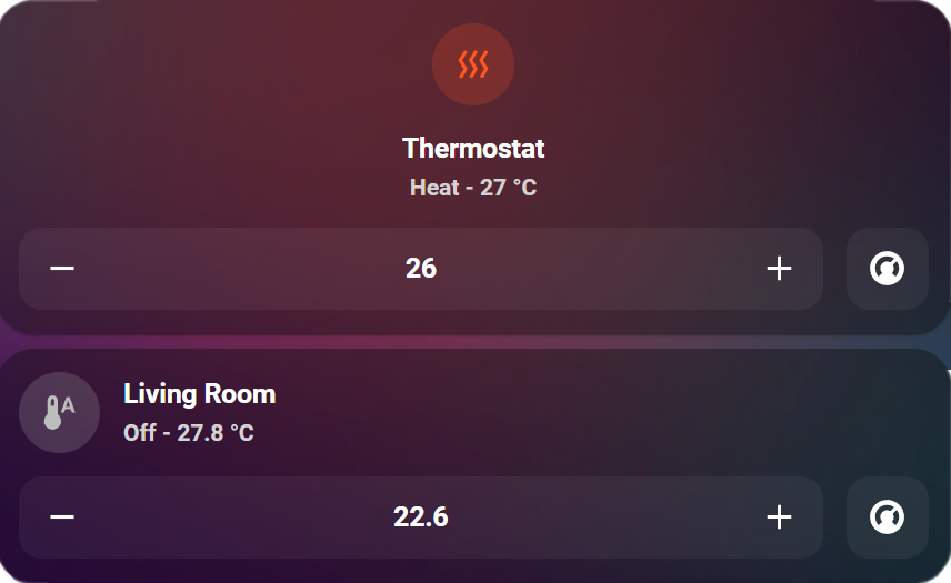
type: custom:mushroom-climate-card
entity: climate.thermostat
show_temperature_control: true
hvac_modes:
  - heat_cool
  - 'off'
icon: mdi:heat-wave
layout: vertical
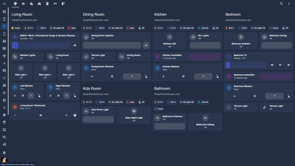
Room Layout
There are a bunch of different ways you can organize and design your Home Assistant dashboard. Some users prefer to organize by entity type (eg. all lights on one view), others by rooms. Of course, there is no absolute rule that you must follow. You style your dashboard the best way it works for you. As an example, we are going to create a room layout using Mushroom Cards.
For those interested, the hardware used to feed information and control our Smart Home:
- Each room has its own LYWSD02 Temperature & Humidity Sensor. Their BLE packets are captured with an ESP32 and fed into Home Assistant
- Most rooms have Aqara Door & Window sensors installed either on doors or windows
- The kitchen and bathroom have an Aqara Water Leak sensor under the sinks
- Each light has a ZigBee based switch/dimmer from various brands (mostly Moes)
- Living Room and Dining Room windows have ZigBee Zemismart shutter motors
- A few Google Nest Minis as Voice Assistants
- Each Room is a couple of horizontal-stack cards nested within a vertical-stack cards. The rest is exclusively Mushroom Cards
You can create your room using nothing but the UI. For the purpose of this tutorial, we are going to share the YAML for each card.
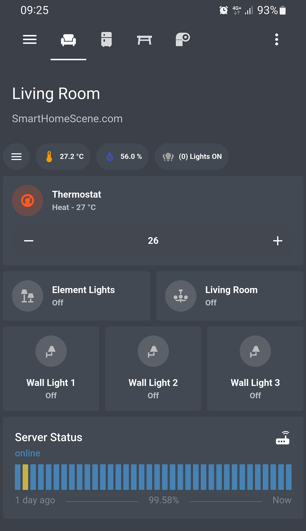
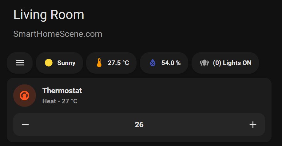
1. Creating a card header
First, we are going to create a card header using the Title card and Chips card. This will allow important information to be available at a glance for that particular room.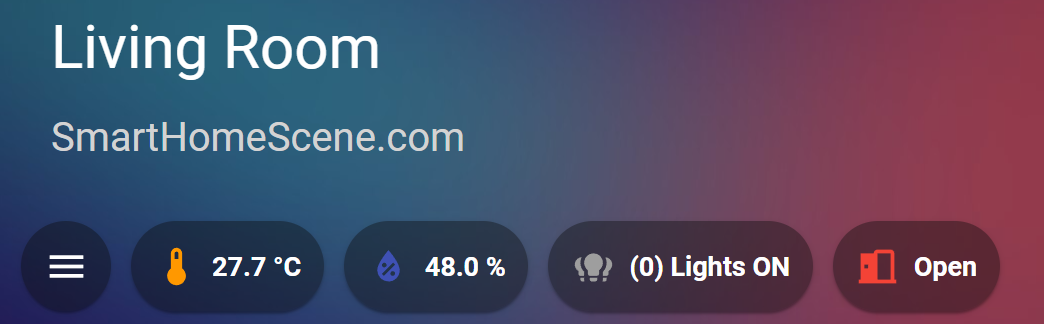
Both the Title and Subtitle can contain templates. You can get creative and push some dynamic information to these two fields. In the chips card, we will display temperature and humidity info for the room, a binary door sensor and create a template chip which will tell us how many lights are currently turned on in the room.
type: vertical-stack
cards:
  - type: custom:mushroom-title-card
    title: Living Room
    subtitle: SmartHomeScene.com
    alignment: justify
  - type: custom:mushroom-chips-card
    chips:
      - type: menu
      - type: entity
        entity: sensor.living_room_temperature
        icon_color: orange
      - type: entity
        entity: sensor.living_room_humidity
        icon_color: indigo
      - type: template
        content: |-
          {% set total = 0 %}
          {% if is_state('light.sonoff_element_lights', 'on') %}
            {% set total = total + 1 %}
          {% endif %}
          {% if is_state('light.living_room', 'on') %}
            {% set total = total + 1 %}
          {% endif %}
          {% if is_state('light.wall_light_1', 'on') %}
            {% set total = total + 1 %}
          {% endif %}
          {% if is_state('light.wall_light_2', 'on') %}
            {% set total = total + 1 %}
          {% endif %}
          {% if is_state('light.wall_light_3', 'on') %}
            {% set total = total + 1 %}
          {% endif %}
          ({{total}}) Lights ON
        icon: mdi:lightbulb-group
        icon_color: |-
          {% if is_state('light.sonoff_element_lights', 'on') %}
            orange
          {% elif is_state("light.living_room", "on") %}
            orange
          {% else %}
            grey
          {% endif %}
        tap_action:
          action: more-info
        entity: light.sonoff_element_lights
      - type: template
        icon: |-
          {% if is_state('binary_sensor.terrace_door', 'off') %}
            mdi:door-closed
          {% else %}
            mdi:door-open
          {% endif %}
        content: |-
          {% if is_state('binary_sensor.terrace_door', 'off') %}
            Closed
          {% else %}
            Open
          {% endif %}
        icon_color: |-
          {% if is_state('binary_sensor.terrace_door', 'off') %}
            green
          {% else %}
            red
          {% endif %}
        tap_action:
          action: more-info
        entity: binary_sensor.terrace_door
    alignment: start
Lights who are currently ON are counted by a template code placed directly in the card. Each light is listed as an IF statement, which adds a plus 1 to the total sum of lights with state ON. Similar conditions are set for name, icon and icon color.
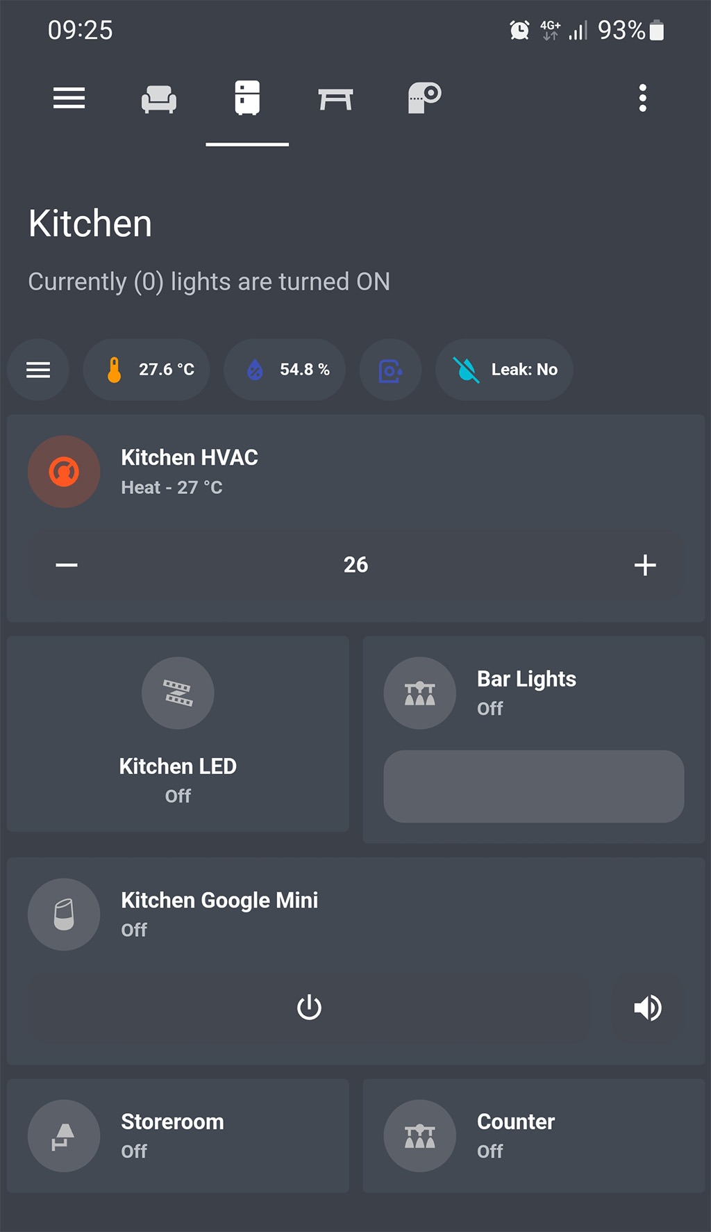
Note: The best way to approach this lights counter is to create a template sensor (platform: template) and simply add it as an entity. We decided to include the code directly in the card because it’s easier to copy-paste. As another example, we can add the number of lights counter as a subtitle in the Title card, and let’s say, add a chip card to tell you if there’s a leak in the kitchen: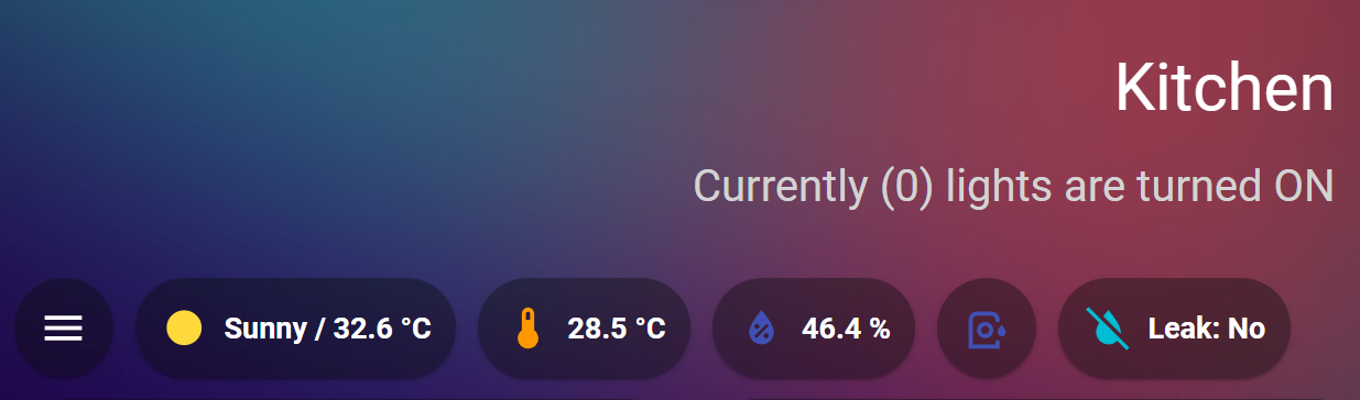
type: vertical-stack
cards:
  - type: custom:mushroom-title-card
    title: Kitchen
    subtitle: |-
      {% set total = 0 %}
      {% if is_state('light.sonoff_kitchen_led', 'on') %}
        {% set total = total + 1 %}
      {% endif %}
      {% if is_state('light.bar_lights', 'on') %}
        {% set total = total + 1 %}
      {% endif %}
      Currently ({{total}}) lights are turned ON
    alignment: end
  - type: custom:mushroom-chips-card
    chips:
      - type: menu
      - type: weather
        entity: weather.home
        show_conditions: true
        show_temperature: true
      - type: entity
        entity: sensor.kitchen_temperature
        icon_color: orange
      - type: entity
        entity: sensor.kitchen_humidity
        icon_color: indigo
      - type: action
        icon_color: indigo
        icon: mdi:air-humidifier
        tap_action:
          action: call-service
          service: humidifier.toggle
          data: {}
          target:
            entity_id: humidifier.kitchen
      - type: template
        content: |-
          {% if is_state('binary_sensor.kitchen_water_leak_sensor', 'off') %}
            Leak: No
          {% else %}
            Leak: YES!
          {% endif %}
        icon: |-
          {% if is_state('binary_sensor.kitchen_water_leak_sensor', 'off') %}
            mdi:water-off
          {% else %}
            mdi:water
          {% endif %}
        icon_color: |-
          {% if is_state('binary_sensor.kitchen_water_leak_sensor', 'off') %}
            cyan
          {% else %}
            red
          {% endif %}
        entity: binary_sensor.kitchen_water_leak_sensor
        tap_action:
          action: more-info
    alignment: start
An Action chip can be added for quick-toggling your humidifier entity. The rest are also conditional template sensors for icons, icon colors and content.
2. Creating a card body
After the header is styled the way you want it, we can continue to build the main body of the card. Depending on which room you are creating, this can contain lights, media player entities, climate entities or whatever else makes sense to you. Lets continue with an example: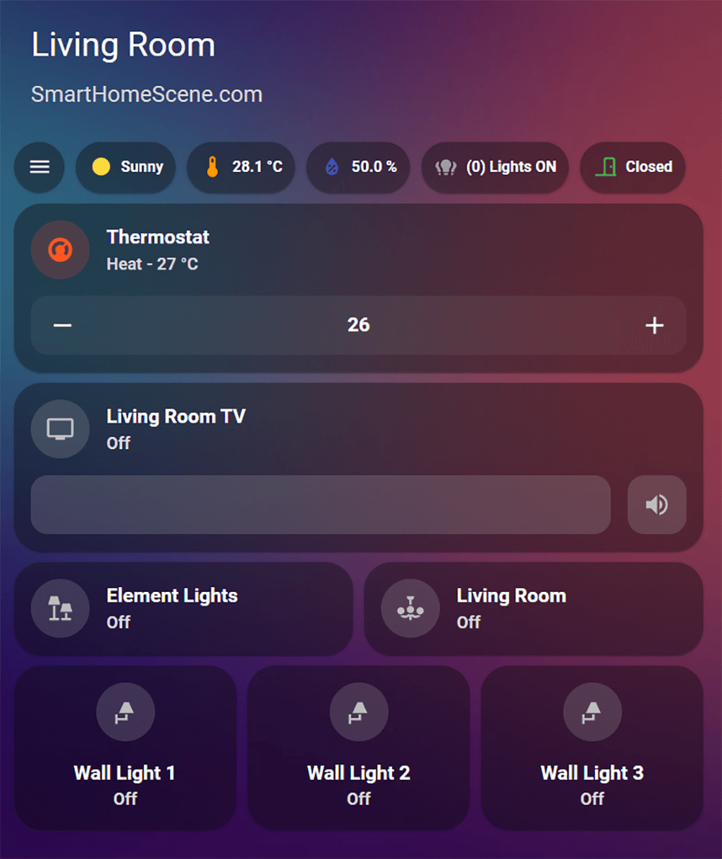
The grid layout is just a few horizontal-stack cards nested within a vertical-stack. You can change the layout of whichever entity you add here: horizontal or vertical. If you are not satisfied with the level of customization an entity card offers for example, you can always achieve the same outcome but with more customization by using a Template card. The code for this particular example is as follows:
type: vertical-stack
cards:
  - type: custom:mushroom-title-card
    title: Living Room
    subtitle: SmartHomeScene.com
    alignment: justify
  - type: custom:mushroom-chips-card
    chips:
      - type: menu
      - type: weather
        entity: weather.home
        show_conditions: true
        show_temperature: false
      - type: entity
        entity: sensor.living_room_temperature
        icon_color: orange
      - type: entity
        entity: sensor.living_room_humidity
        icon_color: indigo
      - type: template
        content: |-
          {% set total = 0 %}
          {% if is_state('light.sonoff_element_lights', 'on') %}
            {% set total = total + 1 %}
          {% endif %}
          {% if is_state('light.living_room', 'on') %}
            {% set total = total + 1 %}
          {% endif %}
          {% if is_state('light.wall_light_1', 'on') %}
            {% set total = total + 1 %}
          {% endif %}
          {% if is_state('light.wall_light_1', 'on') %}
            {% set total = total + 1 %}
          {% endif %}
          {% if is_state('light.wall_light_1', 'on') %}
            {% set total = total + 1 %}
          {% endif %}
          ({{total}}) Lights ON
        icon: mdi:lightbulb-group
        icon_color: |-
          {% if is_state('light.sonoff_element_lights', 'on') %}
            orange
          {% elif is_state("light.living_room", "on") %}
            orange
          {% else %}
            grey
          {% endif %}
        tap_action:
          action: more-info
        entity: light.sonoff_element_lights
      - type: template
        icon: |-
          {% if is_state('binary_sensor.terrace_door', 'off') %}
            mdi:door-closed
          {% else %}
            mdi:door-open
          {% endif %}
        content: |-
          {% if is_state('binary_sensor.terrace_door', 'off') %}
            Closed
          {% else %}
            Open
          {% endif %}
        icon_color: |-
          {% if is_state('binary_sensor.terrace_door', 'off') %}
            green
          {% else %}
            red
          {% endif %}
        tap_action:
          action: more-info
        entity: binary_sensor.terrace_door
    alignment: start
  - type: custom:mushroom-climate-card
    entity: climate.thermostat
    fill_container: false
    hvac_modes:
      - heat_cool
    show_temperature_control: true
  - type: custom:mushroom-media-player-card
    entity: media_player.bravia_tv
    name: Living Room TV
    use_media_info: true
    show_volume_level: true
    volume_controls:
      - volume_set
      - volume_buttons
      - volume_mute
    media_controls: []
    fill_container: false
    icon: mdi:television
    icon_type: entity-picture
  - type: horizontal-stack
    cards:
      - type: custom:mushroom-light-card
        entity: light.sonoff_element_lights
      - type: custom:mushroom-light-card
        entity: light.living_room
        name: Living Room
  - type: horizontal-stack
    cards:
      - type: custom:mushroom-light-card
        entity: light.wall_light_1
        layout: vertical
      - type: custom:mushroom-light-card
        entity: light.wall_light_2
        layout: vertical
      - type: custom:mushroom-light-card
        entity: light.wall_light_3
        layout: vertical
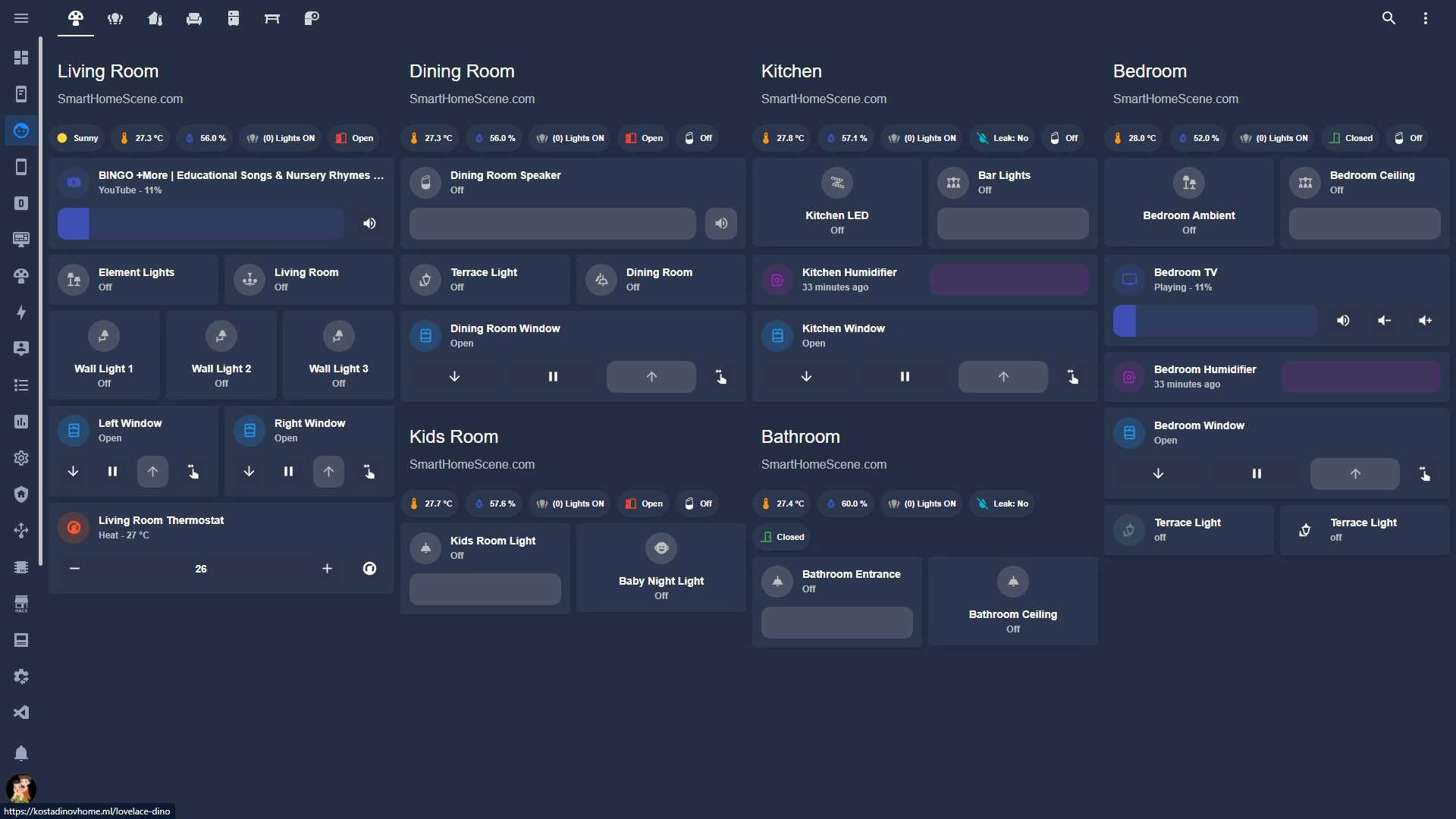
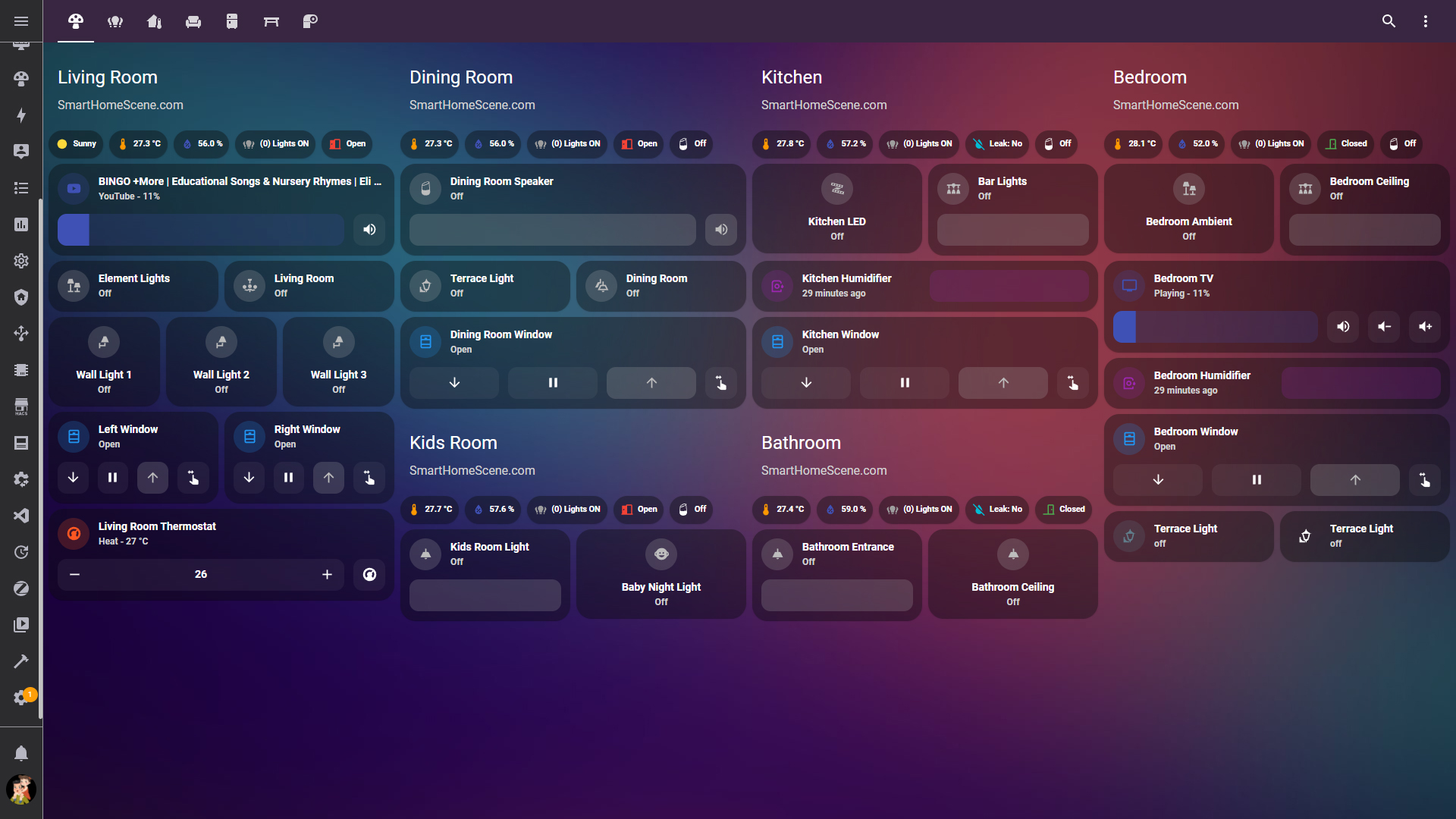
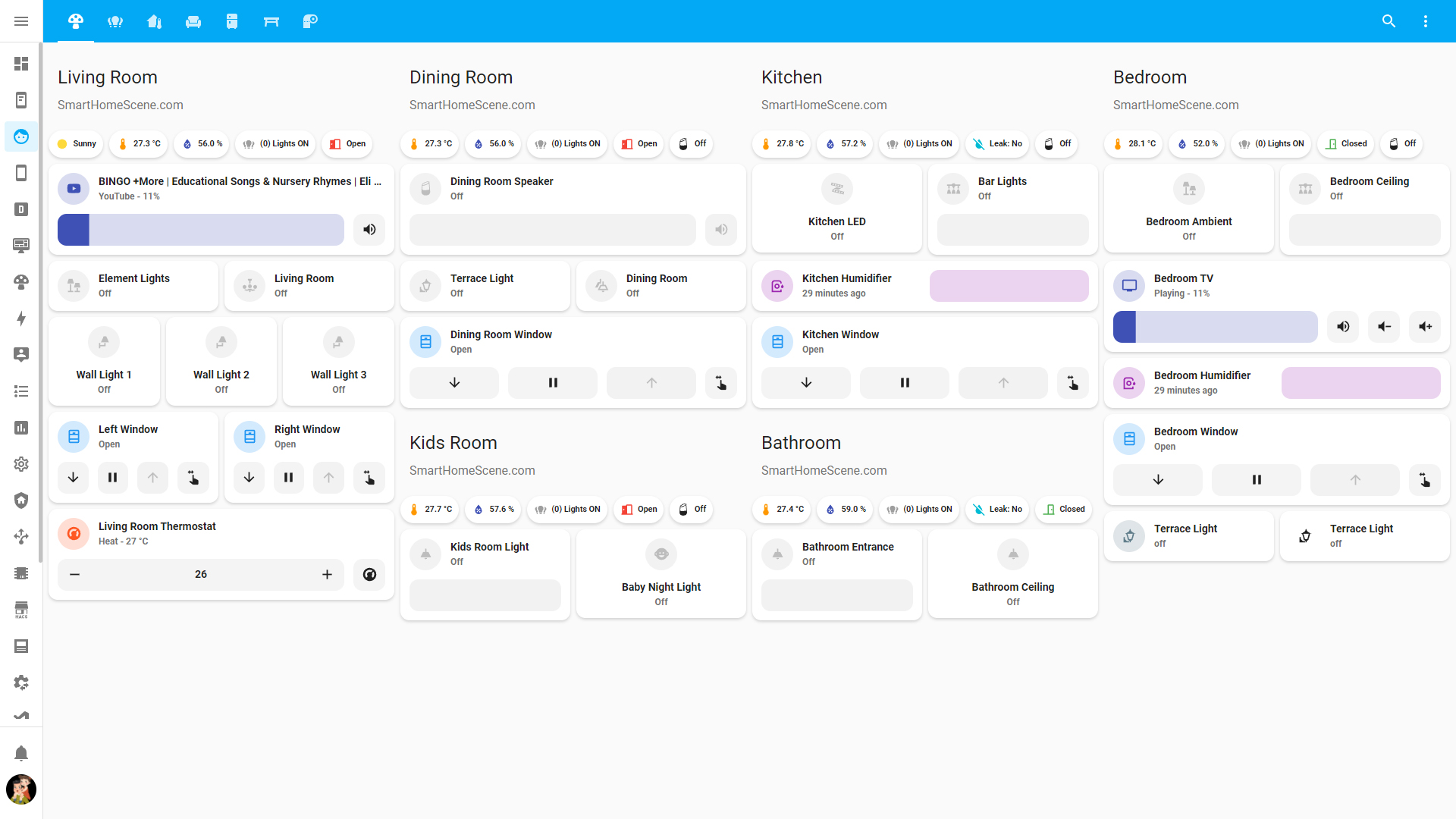
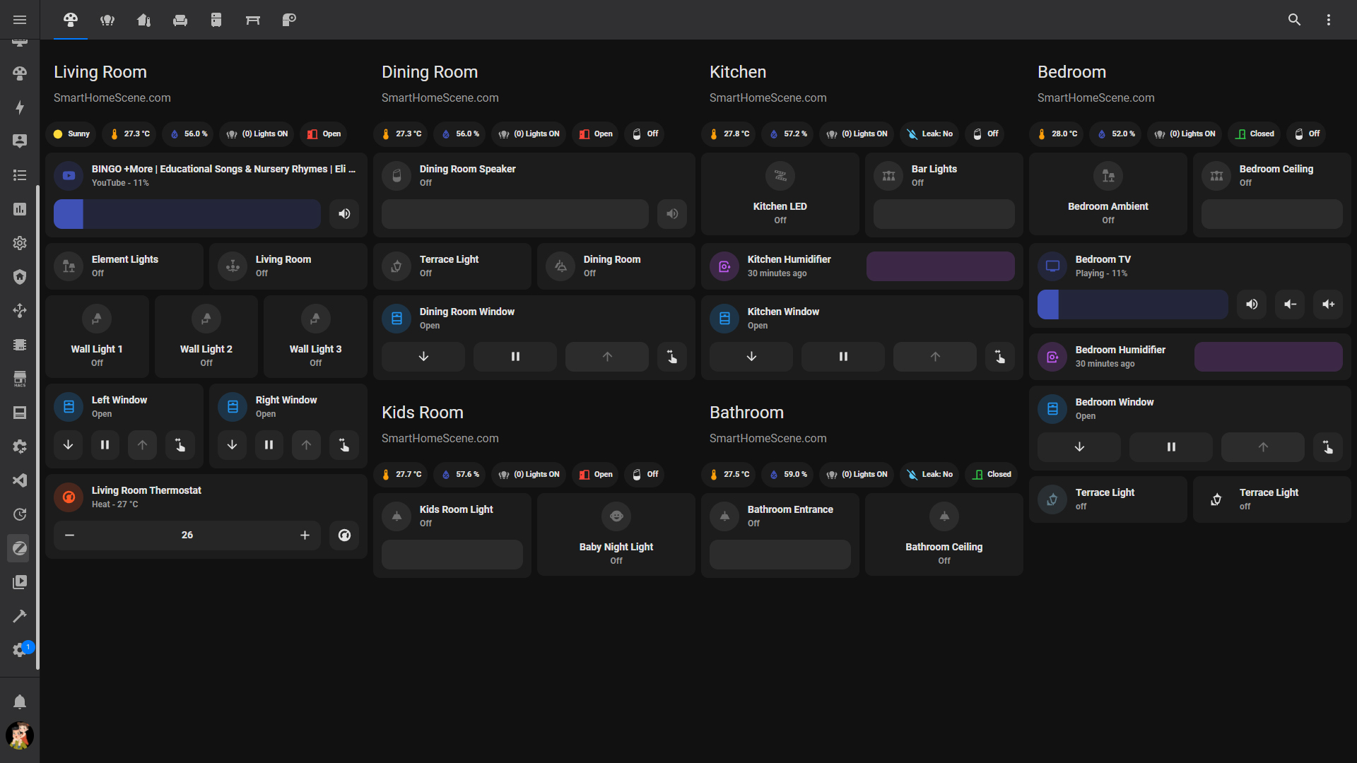
3. Arranging room cards
This completes our guide of creating a basic room card in Mushroom. Repeat the same process for each room you want to create: living room, kitchen, bedroom, kids room, bathroom etc. This is by far the easiest way to have a single room displayed as an individual card (vertical-stack) which can be arranged in a manner most suitable to you.
After you’ve created your rooms, you can rearrange them by editing the dashboard and simply moving them up or down. Depending on your setup, your end result should look something like this: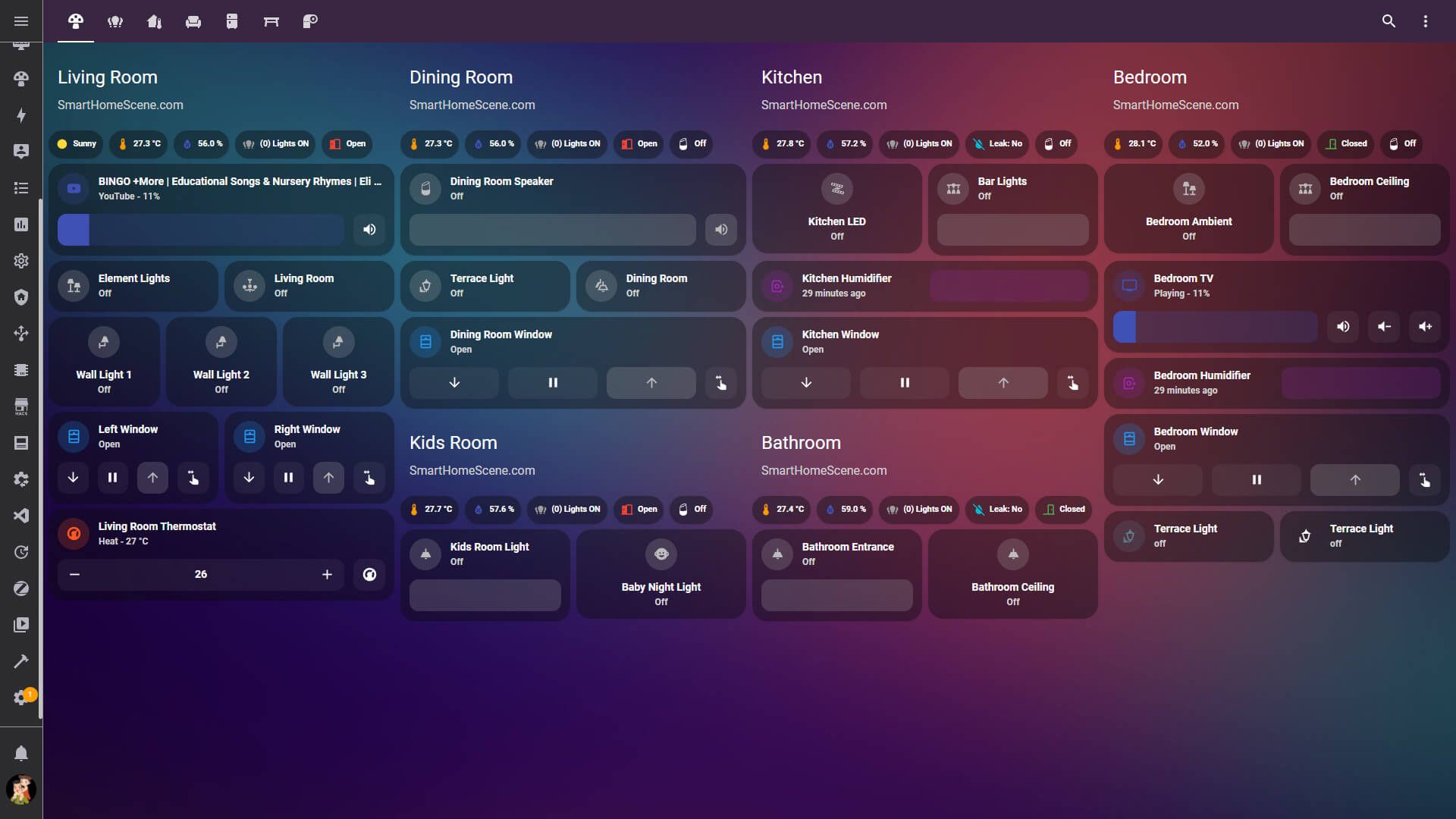
4. Mobile Dashboard
For those of your thinking, this layout is not really suitable for a mobile device, you are probably right. It’s not really handy to scroll through all available rooms just to toggle lights in each room. We recommend two different approaches for a mobile dashboard: grouping by entity type or creating a separate view for each room!
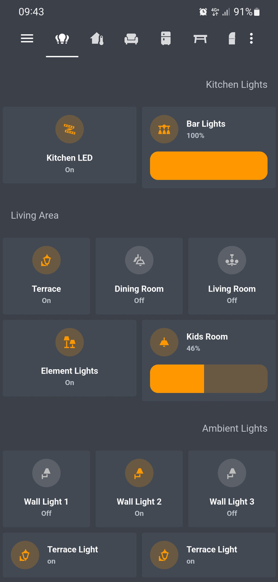
Grouping by entity type
With the first approach you can place all your lights on a single screen. That way you can control everything from one view and not scroll to the kitchen to turn off that counter led. The same can be done for temperature graphs, media player entities or remote control cards. Here’s how an all lights card would look like on a mobile device:
Separate views for each room
With the second approach, each room will be represented by a separate view. This will allow for a more clean layout for a mobile screen. Considering a mobile screen is narrow in width, we suggest setting icons for each room view instead of title text, which will allow you to display more rooms in the header.
For easier room selection, we will use the swipe navigation module. This module allows for swiping through views in your dashboard, a functionality Home Assistant is natively missing. You can find this card in HACS, and once installed add the following code to your dashboard yaml code, above anything else:
swipe_nav:
  wrap: true
  prevent_default: true
  swipe_amount: 25
title: Mushroom
views:
.....
You can fiddle with the sensitivity to reach your sweet spot. If some tabs need skipping, you can add skip_tabs: 1, 3, 5 for example and skip those when swiping.
Additional tips
The focus of Mushroom Cards has never been high customization, per dev piitaya. The cards don’t include options to change icon size or font by default. But, considering we are talking about Home Assistant much can be achieved with a little bit or tinkering.
Styling using Mushroom Themes
The developer has released a Mushroom Theme for his card collection, whose variables can be used to natively change the design of Mushroom Cards. First, we need to install Mushroom Themes from the Home Assistant Community Store (HACS). Search for it under HACS > Frontend.
After you’ve installed it, we are going to duplicate the theme to preserve the original and experiment with the copy.
- Open your file editor (Studio Code Server, File Editor etc.)
- Navigate to config > themes > mushroom
- Create a copy of mushroom.yaml and rename it to mushroom-custom.yaml
- Open mushroom-custom.yaml in your editor
In this file, rename Mushroom: to Mushroom Custom: so you can tell them apart in the theme selector later. Copy over any of the following variables and edit them to your liking. Once you are done, you need to reload themes for your new custom theme to show up in the menu. You can do this by calling the service frontend.reload_themes in developer options or by simply restarting HA.
Mushroom Custom:
    # HA variables
    ha-card-box-shadow: 0px 2px 4px 0px rgba(0,0,0,0.16)
    ha-card-border-radius: 12px
    # Mushroom layout
    mush-spacing: 12px
    # Title
    mush-title-padding: 24px 12px 16px
    mush-title-spacing: 12px
    mush-title-font-size: 24px
    mush-title-font-weight: normal
    mush-title-line-height: 1.2
    # Subtitle
    mush-subtitle-font-size: 16px
    mush-subtitle-font-weight: normal
    mush-subtitle-line-height: 1.2
    # Card
    mush-card-primary-font-size: 14px
    mush-card-secondary-font-size: 12px
    mush-card-primary-font-weight: bold
    mush-card-secondary-font-weight: bolder
    mush-card-primary-line-height: 1.5
    mush-card-secondary-line-height: 1.5
    # Chip
    mush-chip-spacing: 8px
    mush-chip-padding: 0 0.25em
    mush-chip-height: 36px
    mush-chip-border-radius: 18px
    mush-chip-font-size: 0.3em
    mush-chip-font-weight: bold
    mush-chip-icon-size: 0.5em
    mush-chip-avatar-padding: 0.1em
    mush-chip-avatar-border-radius: 50%
    mush-chip-box-shadow: var(--ha-card-box-shadow)
    mush-chip-background: var(--ha-card-background)
    # Control
    mush-control-border-radius: 12px
    mush-control-height: 42px
    mush-control-button-ratio: 1
    mush-control-icon-size: 0.5em
    # Slider
    mush-slider-threshold: 10
    # Badge
    mush-badge-size: 16px
    mush-badge-icon-size: 0.75em
    mush-badge-border-radius: 50%
    # Icon
    mush-icon-border-radius: 50%
    mush-icon-size: 42px
    mush-icon-symbol-size: 0.5em
    # Colors
    mush-rgb-red: 244, 67, 54
    mush-rgb-pink: 233, 30, 99
    mush-rgb-purple: 156, 39, 176
    mush-rgb-deep-purple: 103, 58, 183
    mush-rgb-indigo: 63, 81, 181
    mush-rgb-blue: 33, 150, 243
    mush-rgb-light-blue: 3, 169, 244
    mush-rgb-cyan: 0, 188, 212
    mush-rgb-teal: 0, 150, 136
    mush-rgb-green: 76, 175, 80
    mush-rgb-light-green: 139, 195, 74
    mush-rgb-lime: 205, 220, 57
    mush-rgb-yellow: 255, 235, 59
    mush-rgb-amber: 255, 193, 7
    mush-rgb-orange: 255, 152, 0
    mush-rgb-deep-orange: 255, 87, 34
    mush-rgb-brown: 121, 85, 72
    mush-rgb-grey: 158, 158, 158
    mush-rgb-blue-grey: 96, 125, 139
    mush-rgb-black: 0, 0, 0
    mush-rgb-white: 255, 255, 255

    mush-rgb-info: var(--mush-rgb-blue)
    mush-rgb-success: var(--mush-rgb-green)
    mush-rgb-warning: var(--mush-rgb-orange)
    mush-rgb-danger: var(--mush-rgb-red)

    mush-rgb-state-fan: var(--mush-rgb-green)
    mush-rgb-state-light: var(--mush-rgb-orange)
    mush-rgb-state-entity: var(--mush-rgb-blue)
    mush-rgb-state-switch: var(--mush-rgb-blue)

    mush-rgb-state-alarm-disarmed: var(--mush-rgb-info)
    mush-rgb-state-alarm-armed: var(--mush-rgb-success)
    mush-rgb-state-alarm-triggered: var(--mush-rgb-danger)

    mush-rgb-state-person-home: var(--mush-rgb-success)
    mush-rgb-state-person-not-home: var(--mush-rgb-danger)
    mush-rgb-state-person-zone: var(--mush-rgb-info)
    mush-rgb-state-person-unknown: var(--mush-rgb-grey)

    mush-rgb-state-cover-open: var(--mush-rgb-blue)
    mush-rgb-state-cover-closed: var(--mush-rgb-disabled)

    mush-rgb-state-climate-auto: var(--mush-rgb-green);
    mush-rgb-state-climate-cool: var(--mush-rgb-blue);
    mush-rgb-state-climate-dry: var(--mush-rgb-orange);
    mush-rgb-state-climate-fan-only: var(--mush-rgb-blue-grey);
    mush-rgb-state-climate-heat: var(--mush-rgb-deep-orange);
    mush-rgb-state-climate-heat-cool: var(--mush-rgb-green);
    mush-rgb-state-climate-idle: var(--mush-rgb-grey);
    mush-rgb-state-climate-off: var(--mush-rgb-disabled);

    # You must keep this to support light/dark theme
    modes:
        light:
            mush-rgb-disabled: 189, 189, 189
        dark:
            mush-rgb-disabled: 111, 111, 111
The variables themselves are pretty self explanatory, and a lot can be changed such as font size, icon size, border radius, color etc. Since this file is a copy, feel free to experiment as much as you want. You will not break anything in HA. Once you are done, select your new theme by clicking your profile > theme > Mushroom Custom.
As an example, let’s say we want to increase chips size. The original are just a tad too small for your huge screen.
Mushroom Custom:
  # Chip
  mush-chip-spacing: 6px
  mush-chip-padding: 0 0.35em
  mush-chip-height: 40px
  mush-chip-border-radius: 18px
  # Home Assistant override
  ha-card-box-shadow: 0px 2px 4px 0px rgba(0,0,0,0.16)
  ha-card-border-radius: 12px
  modes:
    light: {}
    dark: {}
This would increase the spacing, padding and chip height making it more readable. You can experiment with any variable to achieve a wanted effect. The variables are too many to cover in this tutorial, but if you apply a little logic and tinker a bit you can deep-customize mushroom cards.
Improtant: Whenever you make a change to your mushroom-custom.yaml file, you need to reload it for HA to be able to refresh the changes. The easiest way to do this: Press C on any screen while in HA and click Reload Themes.
Combining with other cards
Mushroom is a great beginner friendly card collection. The built-in UI streamlines a lot of things and makes it easier in designing a premium looking dashboard. But, as we mentioned earlier, deep-customization is not this cards focus. For this reason, sometimes they can feel a bit limited. Luckily, you can easily feel the gaps by combining other custom cards with mushroom cards and make it all fell as one.
For example, Mushroom lacks a graphing card for your historic data. We can use the great mini-graph-card for this purpose (you can find it in HACS). Let’s say we want to show historic temperature & humidity data for the living room while following the flow of our room layout: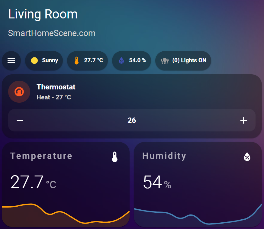
type: vertical-stack
cards:
  - type: custom:mushroom-title-card
    title: Living Room
    subtitle: SmartHomeScene.com
    alignment: justify
    .....
  - type: horizontal-stack
    cards:
      - type: custom:mini-graph-card
        entities:
          - sensor.living_room_temperature
        name: Temperature
        hours_to_show: 24
        points_per_hour: 0.25
      - type: custom:mini-graph-card
        entities:
          - sensor.living_room_humidity
        name: Humidity
        hours_to_show: 24
        points_per_hour: 0.25
        line_color: steelblue
        .....
As another example, let’s say you want to use another thermostat card instead of Mushrooms. Like the simple-thermostat card by dev nervetattoo: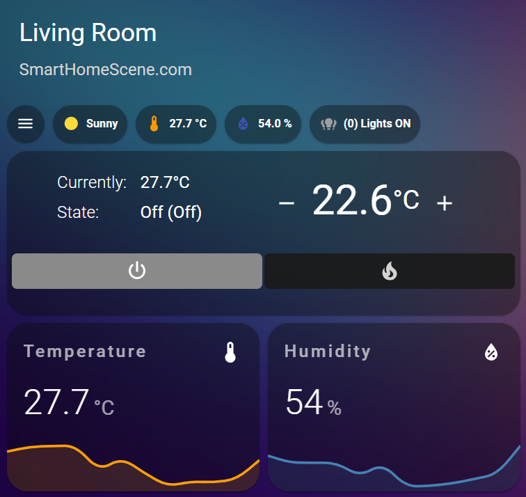
type: vertical-stack
cards:
  - type: custom:mushroom-title-card
    title: Living Room
    subtitle: SmartHomeScene.com
    alignment: justify
    .....
  - type: horizontal-stack
    cards:
      - type: custom:simple-thermostat
        style: |
          ha-card {
            --st-font-size-xl: 40px;
            --st-spacing: 5px;
            --st-font-size-m: 25px;
            --st-font-size-sensors: 16px
          }
        entity: climate.living_room
        step_size: 0.1
        header: false
        layout:
          step: row
          mode:
            names: false
            headings: false
            icons: true
        control:
          - hvac
        .....
Let’s say you want to track your server uptime, placed as a footer for your room card. Using uptime card by dev dylandoamaral, we can style it to match our Mushroom design.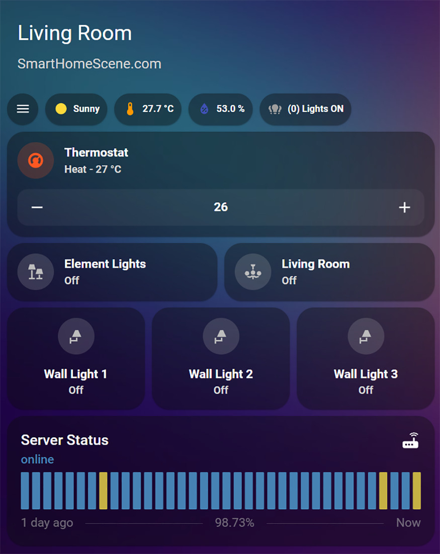
type: vertical-stack
cards:
  - type: custom:mushroom-title-card
    title: Living Room
    subtitle: SmartHomeScene.com
    alignment: justify
    .....
  - type: custom:uptime-card
    entity: sensor.rpi4_online_status
    icon: mdi:router-wireless
    ok: online
    ko: offline
    ko_icon: mdi:router-wireless-off
    hours_to_show: 24
    status_adaptive_color: true
    color:
      icon: white
      title: white
      ok: steelblue
      ko: orangered
    show:
      icon: true
      status: true
      timeline: true
      average: true
    bar: {}
    init: {}
    alias: {}
    tooltip:
      hour24: true
    tap_action: {}
    blink: {}
    title_template: Server Status
    .....
Summary & Screenshots
Hopefully by following our tutorial you will be able to create the dashboard you’ve always wanted. There are absolutely no rules when creating your layout and deciding what goes where. Please remember that our tutorial is just guidelines and tips, and not a definite ruleset. Use your imagination and style it according to your needs.
Feel free to ask questions in the comments bellow. If we’ve given you some ideas or maybe helped you solved an issue, please consider buying us a coffee!


When implementing your ‘count’ template, I’ve used the simpler expand function, which means I can use a single line to get a number indicating how many lights (or plugs, or whatever that’s in a group) are on.
{% set total = expand(‘group.lounge’) | selectattr(‘state’,’eq’,’on’)
| list | count %}
Its worth exploring if you haven’t used that option before
Hello ARALLSOPP,
Thanks for the tip! Yes, I have used a similar function like that, I’ve created a dynamic template sensor whose state is a integer with the lights with state ON listed in it. And than use that sensor directly as an entity.
But I’ve decided to show this code as an example, for beginners to be able to change the list of entities right from the card, without having to create groups or template sensors.
A group would be a better match for different types of entities though, so I agree.
Plus your solution is neater.
Thanks for the reply! Cheers!
Thanks for tips
Hey I really like you chips card! and others
My biggest problem is that I can’t add my current custom theme into the chips card or others. I know mushroom is a theme in it’s self but I have a background color which I use for all cards.
Is there a way to add color or theme picker to background so the aren’t transparent?
Thanks
Hello,
Mushroom should inherit your theme setup automatically. If it does not, something is maybe wrong.
You can send me some screenshots with a short explanation at admin@smarthomescene.com and I’ll look into it.
Another way to set card background would be by using card-mod:
style: |ha-card {
background-color: var(--primary-primary-color);
}
Replace background color with whatever color you like.
Ok thanks I will.. tried several variations. I knew I couldn’t post pics here
thanks again
JZ
Since update 2022.11 there is a square white rectangle around chip cards.
Nevermind, after updating Mushroom theme all good.
In the chips card, when adding an cover entity, the state that apears is open or closed.
Is it possible to add the state like: Open – 34% ?
This depends on info your cover entity provides. You will have to use a Template chip instead of an Entity chip.
This way you can display attribute data, eg. the percentage of open close.
Cheers
I’m so glad I found this cover because it is great. I finally have a pretty clean and neat dashboard. Now I’m finishing the last details. One thing that I would like to know if it is possible is for example in a template chip card, the tap action opens more info regarding the chosen entity, if a long press is taken I would like to open the “more info” but of another entity. ?
im using this to get list of all persons home.
{{ states.person|selectattr('state', 'eq', 'home')|map(attribute='attributes.friendly_name')|join('\n')|list }}but i’m getting friendly name with comma in each character “w,a,s,i,f” instead of “wasif” any leads?
Remove the | list from the end of your code:
{{ states.person | selectattr('state', 'eq', 'home') | map(attribute='attributes.friendly_name') | join('\n') }}Let me know how it goes.
UPDATE
if i remove |join(‘\n’) from above i works but all names are listed in single line
I said remove | list, not join.
Thanks a lot. you saved me lot of hassle. It worked as expected. so final working code is
{{ states.person|selectattr(‘state’, ‘eq’,’home’)|map(attribute=’attributes.friendly_name’) |join(‘\n’) }}
This is what i was doing. May be some likes this idea.
[img]https://i.postimg.cc/wMVDJ4T9/Capture.png[/img]
You’re welcome, cheers!
What a great tutorial! I was wondering how to get that nice background you have.
Could you share it?
Thats iOS themes, see here: https://smarthomescene.com/blog/best-home-assistant-dashboard-themes-in-2023/#4-ios-themes
Thanks, it seemed I already had that theme installed, but after putting background: var(–background-image) in my raw configuration editor the background keeps gray. and in my settings I have chosen the ios theme.. don’t know what I’m doing wrong.
Try to clear the cache of your browser (CTRL + F5)
Hello! how do you add action of menu to minimize the card? When I press the menu button, the side menu is minimized
Thanks!
I don’t understand what you mean exactly?
The action menu in the chips card toggles the sidebar, if that’s what you are referring to?
And there is no way to minimize the “vertical-stack” object? The idea is to make a drop-down list with all the areas of the house and when you press the “menu” button, that area will be displayed to see the lights, for example, that are there to control it.
You are talking about a totally different custom card, you cannot do this with Mushroom natively.
For example, you could use Browser Mod for popups: https://smarthomescene.com/guides/browser-mod-custom-popups-replacing-the-more-info-dialog-window/
or you could use the Fold entity row card for expanding an area: https://github.com/thomasloven/lovelace-fold-entity-row
Thanks for the great walkthrough. I’m editing a dashboard in YAML and have mushrooms installed (as well as minimalist UI which I use some cards from); I’m wondering, where can I find the usage and templates for the mushrooms custom-cards please? I’m happy editing in YAML, but can find the documentation for them anywhere! Thanks
Mushroom cards use the Jinja2 templating system of Home Assistant.
You can go through the official documentation for learning through examples:
https://www.home-assistant.io/docs/configuration/templating/
that’s helpful, thank you!