In a recent tutorial, we used the Mushroom Cards collection and showed you how to create a minimalistic and clean Home Assistant dashboard. Today we are tackling the ApexCharts Card by dev RomRider, which is based on ApexCharts.js, an open-source charting library.
Many of us have been using the excellent Mini Graph Card by kalkih to display data in a simple graph in our Home Assistant dashboards. It has a clean, minimalistic look and feel to it and presents history information nicely in Lovelace UI. The Apex Charts Card is like its Big Brother: It dwarfs it in customization variables and data processing capabilities.
This heavily customizable custom card is capable of creating extremely advanced charts in the shape of a line, columns, donut charts, pie charts, scatter graphs and radial bar charts. The ApexCharts Card does not include a built-in UI editor, so you will need to use YAML.
We will go over the card installation and basic config, provide many examples, so you can copy-paste directly to your Lovelace UI and adjust it to your needs.
UPDATE v2.0.0: extend_to_end has been removed and replaced by extend_to with support for now and end.
Installation
HACS
ApexCharts is available in HACS (Home Assistant Community Store).
- Open HACS
- Go to “Frontend” section
- Click button with “+” icon
- Search for “ApexCharts”
Manual
- Download apexcharts-card.js file from the [latest-release].
- Put apexcharts-card.js file into your config/www folder.
- Add reference to apexcharts-card.js in Lovelace. There’s two way to do that:
- Using UI: Configuration → Lovelace Dashboards → Resources Tab → Click Plus button → Set Url as /local/apexcharts-card.js → Set Resource type as JavaScript Module.
Note: If you do not see the Resources Tab, you will need to enable Advanced Mode in your User Profile - Using YAML: Add following code to lovelace section
resources:
    - url: /local/apexcharts-card.js
      type: module
CLI Install
- Move into your config/www directory.
- Grab apexcharts-card.js:
- Add the resource in your lovelace section (as above)
$ wget https://github.com/RomRider/apexcharts-card/releases/download/v1.10.0/apexcharts-card.jsCards Configuration Variables
The ApexCharts Custom Card has an incredible amount of configuration variables, to style and configure the card according to your needs. For the purpose of the length of this tutorial, we are not going to list every single one of them on this blog. Instead, we are going to try to cover most of them through examples in code syntax. You can check all this card has to offer HERE.
Important Variables
To be able to understand how ApexCharts displays data, we will explain some of the most important configuration variables through examples. We are not going to focus too much on cosmetic options, but more on data processing and display options.
The graph_span and span options are used to choose which data will be fetched for the the ApexCharts to process.
The group_by function organizes the data by a specific function (last, min, max, mean…), builds buckets of data by setting duration (10sec, 1min, 7d…), and can fill missing history data.
The transform function can modify raw data coming from HA’s history database using JavaScript.
Example: Display a binary_sensor data as a number. See more HERE.
The data_generator function is an advanced feature which enables you to build your own data out of the last state of a sensor. It completely bypasses the history retrieval and caching mechanism. See more HERE.
- graph_span:
The span of the graph as a time interval.
Show 24h worth of data
type: custom:apexcharts-card
graph_span: 24h
Show 7 days worth of data
type: custom:apexcharts-card
graph_span: 7d- span:
Define the start, end and offset of displayed data selected with graph_span.
Show today’s data
type: custom:apexcharts-card
graph_span: 24h
span:
  start: day
  ..
Show yesterday’s data
type: custom:apexcharts-card
graph_span: 24h
span:
  start: day
  offset: -1d
Show last 30 days worth of data in a line chart
type: custom:apexcharts-card
graph_span: 30d
span:
  end: day
  ..
Show last calendar week data in a line chart
type: custom:apexcharts-card
graph_span: 1w
span:
  end: isoWeek
  offset: -1week
Show 7 days worth of data grouped in a column by day ending with today
type: custom:apexcharts-card
graph_span: 7d
span:
  end: day
series:
  - entity: sensor.stove_time_on_today
    type: column
    group_by:
      func: last
      duration: 1d
Show 4 weeks worth of data grouped in a column by calendar week ending with current week
type: custom:apexcharts-card
graph_span: 28d
span:
  end: isoWeek
series:
  - entity: sensor.stove_time_on_today
    type: column
    group_by:
      func: last
duration: 7d- transform:
Modify raw data coming from Home-Assistant’s history database using a JavaScript function
Convert binary_sensor to numbers (1 is on, 0 is off)
type: custom:apexcharts-card
series:
  - entity: binary_sensor.dishwasher
    transform: "return x === 'on' ? 1 : 0;"
Scale a sensor’s data
type: custom:apexcharts-card
series:
  - entity: sensor.download_kb
    transform: "return x / 1024;"
Usage Examples
This custom card can be used to present data in Lovelace from various sources, from different types of entities or their attributes. We going to cover the most common entity types and their advanced configuration.
Note: In some of the examples of this tutorial, we are using card-mod to further style the cards.
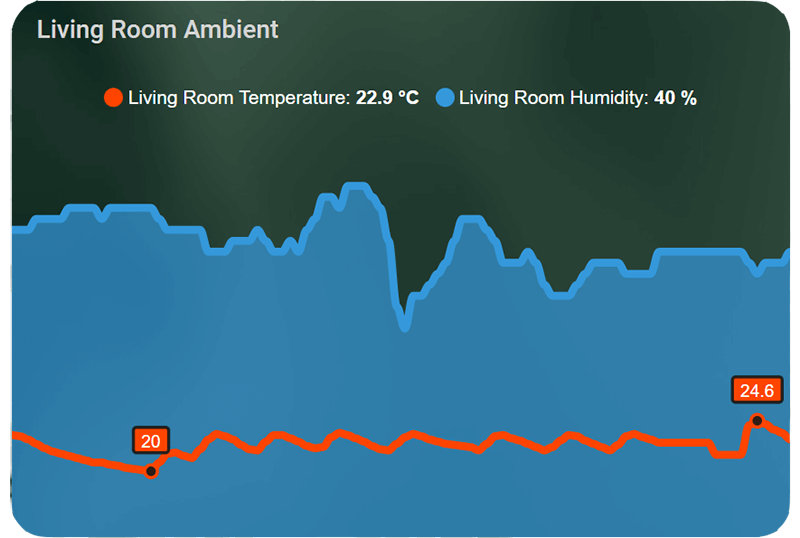
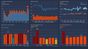
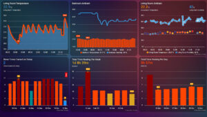
Line, Column, Area
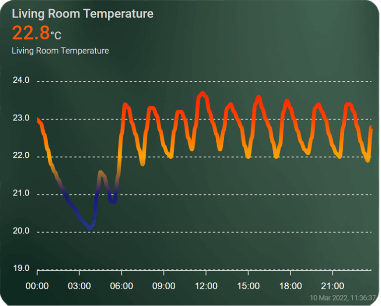
To display temperature data for a specific room in the last 24hours, we use the default line graph. When chart_type is unset, the card defaults to this graph. This chart type has 3 subtypes which can be applied under the series function: Line, Column and Area. For example, we set the span to day, add some custom colors in color_threshold and set our entities under the series variable:
type: custom:apexcharts-card
experimental:
color_threshold: true
graph_span: 24h
show:
last_updated: true
header:
standard_format: false
show: true
show_states: true
colorize_states: true
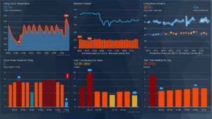
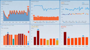
title: Living Room Temperature
span:
start: day
series:
- entity: sensor.living_room_temperature
type: line
group_by:
func: last
duration: 15m
stroke_width: 5
show:
header_color_threshold: true
color_threshold:
- value: 18
color: steelblue
- value: 21
color: midnightblue
- value: 22
color: orange
- value: 23
color: orangered
- value: 24.5
color: red
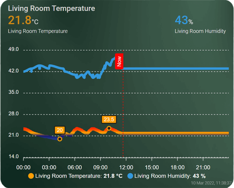
We can further customize the chart by adding the humidity entity, adding a “Now” marker to show our current time of day and adding extremas, to show the minimum and maximum values of our sensor.
type: custom:apexcharts-card
experimental:
  color_threshold: true
graph_span: 24h
show:
  last_updated: true
header:
  standard_format: false
  show: true
  show_states: true
  colorize_states: true
  title: Living Room Temperature
now:
  show: true
  color: red
  label: Now
span:
  start: day
series:
  - entity: sensor.living_room_temperature
    type: line
    group_by:
      func: last
      duration: 15m
    stroke_width: 5
    show:
      extremas: true
      header_color_threshold: true
    color_threshold:
      - value: 18
        color: steelblue
      - value: 21
        color: midnightblue
      - value: 22
        color: orange
      - value: 23
        color: orangered
      - value: 24.5
        color: red
  - entity: sensor.living_room_humidity
    show:
      in_chart: true
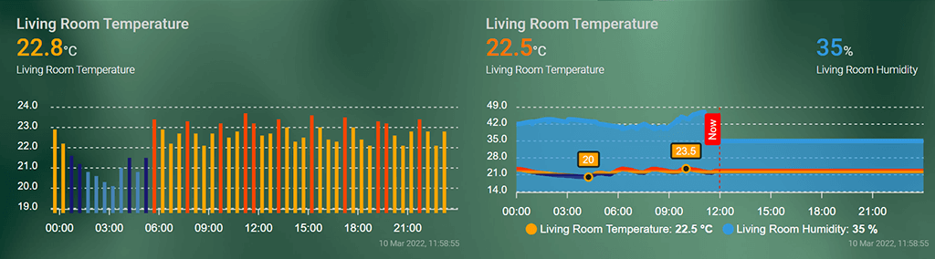
We can convert the chart to a column type or an area graph type. We can also add a custom chart height under apex_config and remove card backgrounds and borders with card-mod.
type: custom:apexcharts-card
style: |
ha-card {
background-color: var(--primary-primary-color);
box-shadow: none;
}
apex_config:
chart:
height: 170px
.....
series:
- entity: sensor.living_room_temperature
type: column
- entity: sensor.living_room_humidity
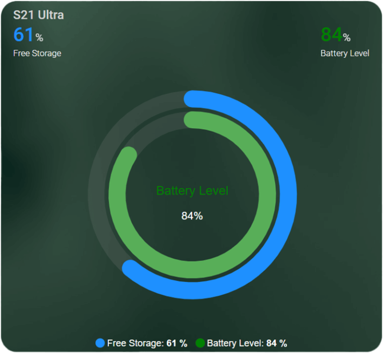
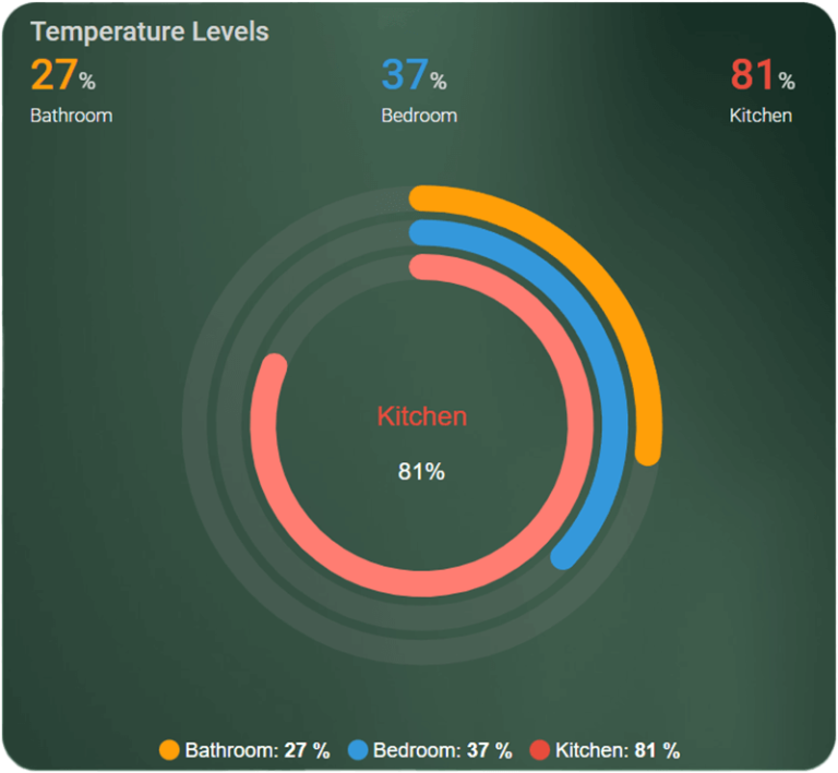
type: area Radial Bar Chart
A Radial Bar can be used to show percentage with predefined min-max values, which must be provided for each series displayed as it requires to convert the value into percentage. If undefined, the default value for min is 0 and for max is 100. This graph works well if you want to display sensors natively in percentages.
type: custom:apexcharts-card
header:
  show: true
  title: Temperature Levels
  show_states: true
  colorize_states: true
chart_type: radialBar
series:
  - entity: sensor.bathroom_battery_level
    name: Bathroom
  - entity: sensor.bedroom_battery_level
    name: Bedroom
  - entity: sensor.kitchen_battery_level
    name: Kitchen
Pie Chart
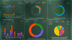
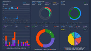
This chart will display a pie-shaped chart with the last value computed of each sensor. In my example, I used sensors created from the utility meter integration to show energy consumption.
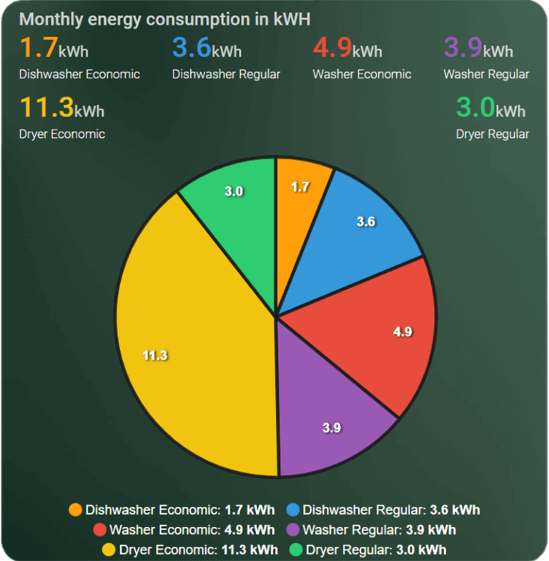
type: custom:apexcharts-card
chart_type: pie
header:
  show: true
  show_states: true
  colorize_states: true
  title: Monthly energy consumption in kWH
series:
  - entity: sensor.dishwasher_kwh_monthly_economic
    name: Dishwasher Economic
  - entity: sensor.dishwasher_kwh_monthly_regular
    name: Dishwasher Regular
  - entity: sensor.washer_kwh_monthly_economic
    name: Washer Economic
    type: column
  - entity: sensor.washer_kwh_monthly_regular
    name: Washer Regular
  - entity: sensor.dryer_kwh_monthly_economic
    name: Dryer Economic
  - entity: sensor.dryer_kwh_monthly_regular
    name: Dryer Regular
    type: column
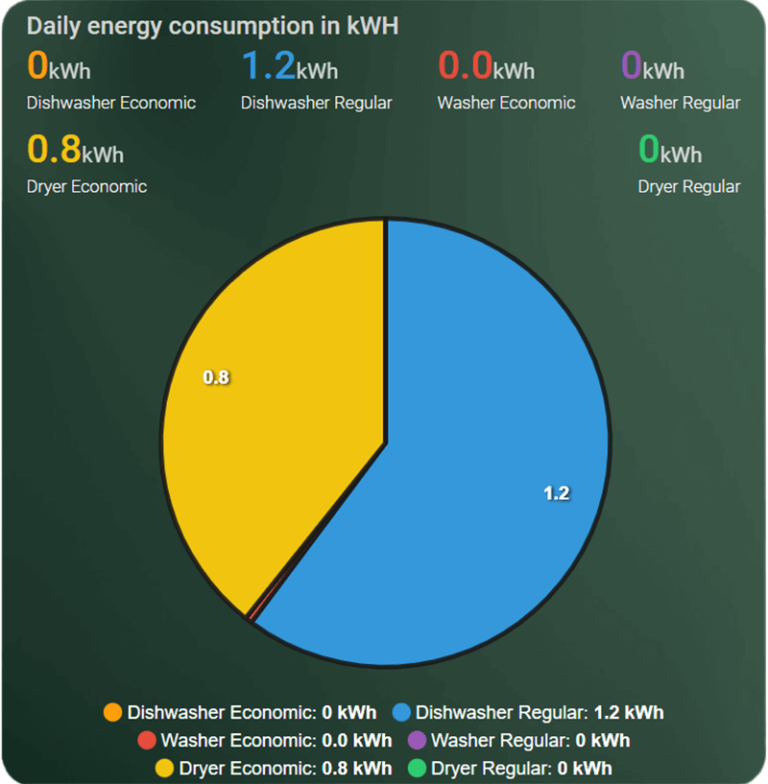
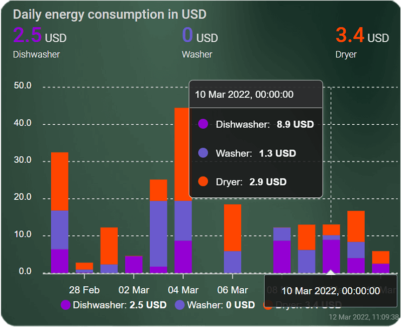
Donut Chart
The donut chart is essentially the same as the pie chart, only with a hole in the middle. In my example, it uses simple template sensors to calculate energy consumption based on electricity price.
Note: Values in pictures are not correct, simply modified to show the chart usage.
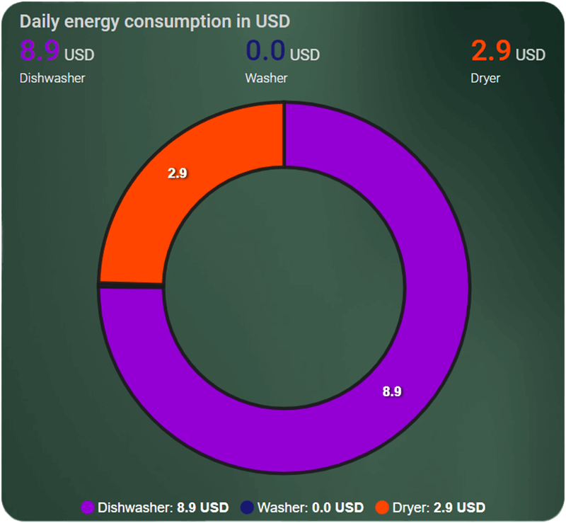
type: custom:apexcharts-card
chart_type: donut
header:
  show: true
  show_states: true
  colorize_states: true
  title: Daily energy consumption in USD
series:
  - entity: sensor.dishwasher_usd_daily
    name: Dishwasher
    type: column
    unit: ' USD'
    color: darkviolet
  - entity: sensor.washer_usd_daily
    name: Washer
    type: column
    unit: ' USD'
    color: midnightblue
  - entity: sensor.dryer_usd_daily
    name: Dryer
    unit: ' USD'
    color: orangered
Scatter Chart
The scatter chart can be used to display a cloud of points, without a line connecting them. When using this chart, be sure to always set the group_by function to something larger than default, because if you have a lot of data with noisy sensors, the chart will get overwhelmed and make no sense.
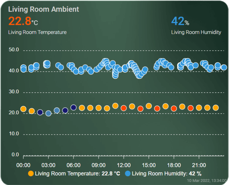
type: custom:apexcharts-card
chart_type: scatter
experimental:
  color_threshold: true
graph_span: 24h
show:
  last_updated: true
header:
  standard_format: false
  show: true
  show_states: true
  colorize_states: true
  title: Living Room Ambient
span:
  start: day
series:
  - entity: sensor.living_room_temperature
    group_by:
      func: last
      duration: 1h
    show:
      header_color_threshold: true
    color_threshold:
      - value: 18
        color: steelblue
      - value: 21
        color: midnightblue
      - value: 22
        color: orange
      - value: 23
        color: orangered
      - value: 24.5
        color: red
  - entity: sensor.living_room_humidity
More Examples
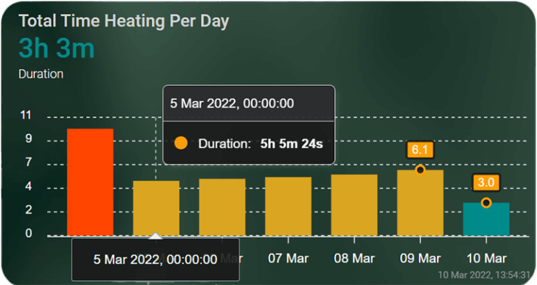
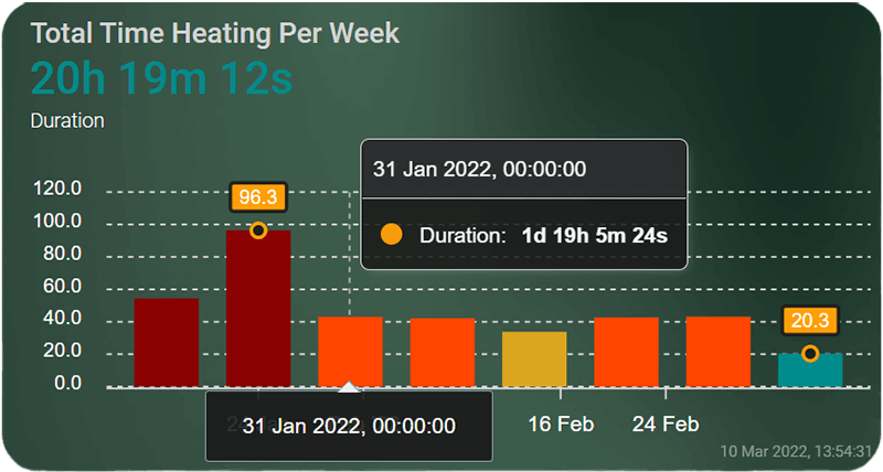
Total Stove Heating Time
When hovered, the ApexCharts Card displays your span and state. We can define the y-axis min and max values and set the tick amount. You can find more about y-axis HERE.
type: custom:apexcharts-card
apex_config:
  chart:
    height: 170px
experimental:
  color_threshold: true
graph_span: 7d
span:
  end: day
show:
  last_updated: true
header:
  show: true
  show_states: true
  colorize_states: true
  title: Total Time Heating Per Day
yaxis:
  - min: 0
    max: ~11
    decimals: 0
    apex_config:
      tickAmount: 5
series:
  - entity: sensor.thermoflux_time_on_today
    show:
      header_color_threshold: true
      extremas: true
      as_duration: hour
    type: column
    name: Duration
    group_by:
      func: last
      duration: 1d
    color_threshold:
      - value: 1
        color: dodgerblue
      - value: 3
        color: darkcyan
      - value: 5
        color: goldenrod
      - value: 7
        color: orangered
      - value: 10
        color: darkred
To get a weekly chart, replace the following variables:
type: custom:apexcharts-card
graph_span: 56d
span:
end: isoWeek
.....
series:
- entity: sensor.thermoflux_time_on_today
group_by:
func: last
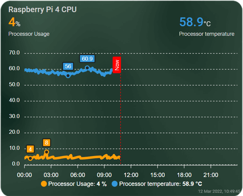
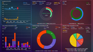
duration: 7d Raspberry Pi Monitor
To monitor processor usage and temperate, we can use the line graph.
type: custom:apexcharts-card
experimental:
color_threshold: true
graph_span: 24h
show:
last_updated: true
loading: false
header:
standard_format: false
show: true
show_states: true
colorize_states: true
title: Raspberry Pi 4 CPU
now:
show: true
color: red
label: Now
span:
start: day
series:
- entity: sensor.processor_use_percent
name: Processor Usage
stroke_width: 5
group_by:
duration: 30sec
show:
extremas: true
header_color_threshold: true
- entity: sensor.processor_temperature
stroke_width: 5
group_by:
duration: 30sec
show:
extremas: true
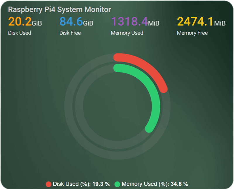
header_color_threshold: trueTo monitor disk usage and memory usage, we can use a RadialBar graph:
type: custom:apexcharts-card
apex_config:
chart:
height: 355px
header:
show: true
title: Raspberry Pi4 System Monitor
show_states: true
colorize_states: true
chart_type: radialBar
series:
- entity: sensor.disk_use
name: Disk Used
show:
in_chart: false
- entity: sensor.disk_free
name: Disk Free
show:
in_chart: false
- entity: sensor.disk_use_percent
name: Disk Used (%)
show:
in_header: false
- entity: sensor.memory_use
name: Memory Used
show:
in_chart: false
- entity: sensor.memory_free
name: Memory Free
show:
in_chart: false
- entity: sensor.memory_use_percent
name: Memory Used (%)
show:
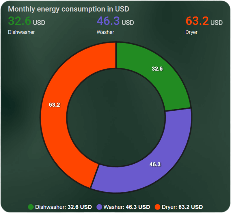
in_header: falseUtility Meter
We can stack the utility meter data, for a daily per device overview spanning 14 days. When hovered it will give us exact data of each appliance monitor in our example along with the correct day.
Note: Values in pictures are not correct, simply modified to show the chart usage.
type: custom:apexcharts-card
apex_config:
  chart:
    stacked: true
graph_span: 14d
span:
  end: day
show:
  last_updated: true
header:
  show: true
  show_states: true
  colorize_states: true
  title: Daily energy consumption in USD
series:
  - entity: sensor.dishwasher_usd_daily
    name: Dishwasher
    type: column
    unit: ' USD'
    color: darkviolet
    group_by:
      func: max
      duration: 1d
  - entity: sensor.washer_usd_daily
    name: Washer
    type: column
    unit: ' USD'
    color: slateblue
    group_by:
      func: max
      duration: 1d
  - entity: sensor.dryer_usd_daily
    name: Dryer
    type: column
    unit: ' USD'
    color: orangered
    group_by:
      func: max
      duration: 1d
Minimal Layout
The ApexCharts card offers a minimal layout which removes the grid, the axis and display the legend at the top. You can combine this clean layout with any types of chart to display it to your liking. For example:
type: custom:apexcharts-card
layout: minimal
graph_span: 24h
header:
  standard_format: false
  show: true
  title: Living Room Ambient
span:
  start: day
series:
  - entity: sensor.living_room_temperature
    color: orangered
    type: line
    group_by:
      func: last
      duration: 15m
    stroke_width: 5
    show:
      extremas: true
      header_color_threshold: true
  - entity: sensor.living_room_humidity
    type: area
    show:
      in_chart: true
    group_by:
      func: last
      duration: 15m
Instead of a line and area, we can change the type variable to display a column and a line:
type: custom:apexcharts-card
layout: minimal
graph_span: 24h
header:
  standard_format: false
  show: true
  title: Bedroom Ambient
span:
  start: day
series:
  - entity: sensor.bedroom_temperature
    color: orangered
    type: column
    group_by:
      func: last
      duration: 30min
    stroke_width: 5
    show:
      extremas: true
      header_color_threshold: true
  - entity: sensor.bedroom_humidity
    type: line
    show:
      in_chart: true
    group_by:
      func: last
      duration: 30m
Summary
The ApexCharts Card includes so many configuration variables, it is impossible to cover all of them in a single tutorial. I hope that the examples we provided will benefit some you so you can copy-paste and adjusts them to your needs.
Because it is based on the open-source charting library ApexCharts.js, it can be customized to infinity. You can check all the options this library offers HERE.
Developer RomRider notes that since this card is in its early stages of development, some bugs or breaking changes may occur. It’s worth noting that in my usage so far, I have encountered none.
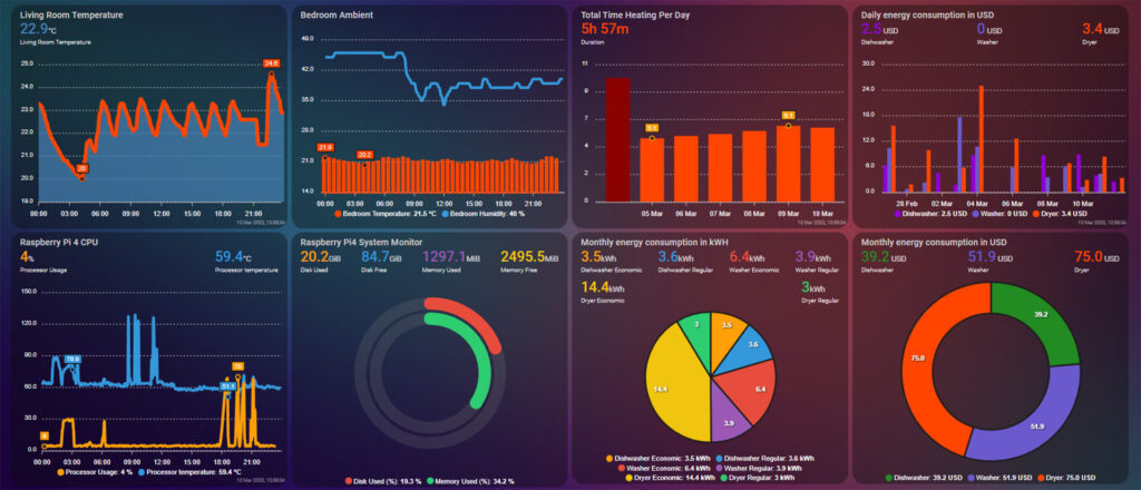
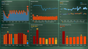
Screenshots


Hi!
First of all, thank you for the very indepth guide! Makes it a breeze to set up!
Just a quick question though, im trying to make it so that Lines, plotter charts etc, show the last 24h, so that «now» would be at the end of the chart
Hello,
You need to specify graph_span: 24h.
This will show the last 24 hours worth of data and now would be at the end of the chart.
Remove the span: end/start variable completely.
Cheers!
Hi there,
Just searching for an apex chart solution for the following challenge:
– my cityheating gateway sends the meter data with three digit decimals. I.e. 0,123.
– when hoovering over a chart column it shows a rounded number, i.e. 0,1 which does not give adequate information.
– how can I program the configuration code in such a way that the collected data is shown without rounding it to 1 digit, in other words, showing 0,123 instead of 0,1?
Thanks for your help!
Hi there,
Found the solution in another post somewhere on the web.
Adding “float_precision: 3” in “series:” gave three decimals!
Thanks Henk, was looking for the exact same thing!
When adding to configuration.yaml
resources:
– url: /local/apexcharts-card.js
type: module
An error
Integration error: resources – Integration ‘resources’ not found.
How do I fix it?
Hello Konstantin,
Please see here for manually adding resources: https://www.home-assistant.io/dashboards/dashboards/
In your configuration yaml, it needs to be:
lovelace:resources:
– url: /local/apexcharts-card.js
type: module
Cheers
Hello SHS
Any suggestion on solving error:
Invalid config for [lovelace]: expected a list for dictionary value @ data[‘lovelace’][‘resources’]. Got OrderedDict([(‘– url’, ‘/local/apexcharts-card.js’), (‘type’, ‘module’)]). (See /config/configuration.yaml, line 28).
line 28 is ‘lovelace:’
The configuration expects a list instead of a dictionary for each subsequent resource. You have structured it wrong, here’s a correct example:
lovelace:resources:
– url: /local/apexcharts-card.js
type: module
– url: /local/history-explorer-card.js
type: module
– url: /local/mini-graph-card.js
type: module
...
Hello,
Great work and lots of good examples. But for me, a newbie using HA, where do you put the actual cards? E.g.
type: custom:apexcharts-card
layout: minimal
graph_span: 24h
…
In what section should I add these?
Hello Tobi,
Everyone was a noob once, so fear not 🙂
You create a new card on your dashboard by clicking the plus button on the bottom right corner. You select manual card from the list and copy the code from the examples above.
Change the entities to yours and you are done 😉
Cheers,
SHS.
Thanks! This helps a lot!
Tobi
I would appreciate your advice. There are two entities: sensor.tasmota1_energy_today and sensor.tasmota2_energy_today
Is it possible to display the total consumption in the header?
Best regards
type: custom:apexcharts-cardchart_type: donut
header:
show: true
show_states: true
colorize_states: true
title: daily energy consumption [kWh]
series:
- entity: sensor.tasmota1_energy_today
name: plug1
type: column
unit: ' kWh'
color: darkviolet
float_precision: 1
- entity: sensor.tasmota2_energy_today
name: plug2
type: column
unit: ' kWh'
color: midnightblue
float_precision: 1
Hello,
You can use the show variable along with in_header:
type: custom:apexcharts-cardchart_type: donut
header:
show: true
show_states: true
colorize_states: true
title: daily energy consumption [kWh]
series:
- entity: sensor.tasmota1_energy_today
name: plug1
type: column
show:
in_header: true
unit: ' kWh'
color: darkviolet
float_precision: 1
- entity: sensor.tasmota2_energy_today
name: plug2
type: column
unit: ' kWh'
color: midnightblue
float_precision: 1
Cheers
Thanks!
I show variables in header, but I want is this two added up so I have the total energy consumption
example: daily energy consumption 2 kWh
Best regards, and wishing you and your loved Merry Christmas
Hi Feri,
You need to create a template sensor adding the two values together. Than you need to use that entity in ApexCharts, hide it everywhere else except the header. This will achieve what you need.
For creating a template sensor, see here: https://www.home-assistant.io/integrations/template/
Merry Christmas and HNY!
Thanks for the answer, I’m studying the templates 🙂
With the new sensor everything is OK
– entity: sensor.daily_energy_total
show:
in_header: true
in_chart: false
Thanks again!
Glad I could help,
Cheers!
How can you show graphs spanning more than 10 days? Isn’t the duration after which data is purged set to 10 days?
Yes it is. However, you can change this to whatever you want. See this guide:
https://smarthomescene.com/guides/optimize-your-home-assistant-database/
I strongly suggest you switch to MariaDB and also include/exclude entities to optimize performance.
Cheers
Cool stuff.
Can I ask what theme you are using?
Yes, it’s the iOS Light & Dark Themes.
https://smarthomescene.com/guides/top-10-home-assistant-lovelace-themes/#1-ios-themes
Is there a way to combine two pieces of data and have no scale? The data I want to use has two different scales. If I leave them as default one will dwarf the other and you can’t see the other data. I want to show the trend of each, I don’t care about the scale.
Yes, you need to define the min and max values for each axis.
type: custom:apexcharts-cardgraph_span: 20min
yaxis:
- id: first # identification name of the first y-axis
decimals: 0
min: 0
max: ~10
apex_config:
tickAmount: 4
- id: second # identification name of the second y-axis
opposite: true # make it show on the right side
decimals: 0
min: 0
max: ~50
apex_config:
tickAmount: 4
all_series_config:
stroke_width: 2
series:
- entity: sensor.random0_100
yaxis_id: first # this serie will be associated to the 'id: first' axis.
- entity: sensor.random_0_1000
yaxis_id: second # this serie will be associated to the 'id: second' axis.
Thanks so much. This is my yaml if it helps others.
“`
type: custom:apexcharts-card
apex_config:
chart:
stacked: true
graph_span: 24h
span:
end: day
show:
last_updated: true
yaxis:
– id: solar
decimals: 0
min: 0
max: ~1000
apex_config:
tickAmount: 4
– id: battery
opposite: true
decimals: 0
min: 0
max: ~100
apex_config:
tickAmount: 4
header:
show: true
show_states: true
colorize_states: true
title: Back/Front Panels Genertation and Battery %
series:
– entity: sensor.lux_solar_output_array_1_live
yaxis_id: solar
transform: return x / 1000;
name: Back
type: column
unit: ‘ kWh’
color: darkviolet
group_by:
func: max
duration: 1h
– entity: sensor.lux_solar_output_array_2_live
yaxis_id: solar
transform: return x / 1000;
name: Front
type: column
unit: ‘ kWh’
color: slateblue
group_by:
func: max
duration: 1h
– entity: sensor.lux_battery
yaxis_id: battery
name: Battery Charge
type: column
unit: ‘ %’
color: green
group_by:
func: max
duration: 1h
“`
Is there a way to change the card size?
Yes,
You can use
apex_config:chart:
height: 170px
Cheers
G’day, great addition! Thanks for all your hard work!
How do you add custom formatting? I’m trying to change the units/scaling used in the radialBar chart type. Any help is appreciated!
Cheers
Hello,
You can use unit:
series:- entity: sensor.dishwasher_usd_daily
name: Dishwasher
type: column
unit: ' USD'
Cheers
Hi again,
Yeah first thing I tried but it doesn’t change the bottom key for the radialBar chart type. Any ideas?
Cheers
This must be a bug, I just hit the same issue. Works for pie
Hi, great tutorial! I have small question: Is it possible to display only the hours on the x-axis? For example, instead of 14:00 it should display 14.
Cheers!
To answer my own question: it is possible.
apex_config:xaxis:
labels:
datetimeFormatter:
hour: 'HH'
Hello,
I would like to know if it is possible to use a “sensor” to define a “max” limit.
like this :
chart_type: radialBar
series:
– entity: sensor.esxi_datastore
max: sensor.esxi_datastore_total_space_gb
Thank for you help
For the pie chart,
How to set this up if the total is known, some portions are known and there is a unknown remaining amount?
When using series and multiple entity, it will show entity name with temperature under the chart, if i use only 1 temperature it wont show it, how to hide entity name with value under the chart when using multiple entity?
You can hide the legend completely with this code:
type: custom:apexcharts-cardapex_config:
legend:
show: false
....
Cheers
I get this error // apexcharts-card version 2.0.4 /// value.series[0] is not a ChartCardSeriesExternalConfig; value.series[0].float_precision is not a number
How to replace float_precision?
type: custom:apexcharts-cardgraph_span: 36h
header:
show: true
title: Dagens energi priser (Öre/kWh)
show_states: true
colorize_states: true
span:
start: day
now:
show: true
label: Now
series:
- entity: sensor.nordpool_kwh_se4_sek_3_10_025
color: green
type: column
float_precision: >-
2 return entity.attributes.times.map((time, index) => { return [new
Date(time).getTime(), entity.attributes.prices });
yaxis:
- decimals: 2
apex_config:
tickAmount: 10
Hello,
float_precision: must be a number, cannot be a template.
Hi there,
first of all great content on here. You really give excellent overviews and very precise examples with code included (kudos!). I was wondering if you ever got the apex_config: theme: palette: to work? Just tried thsi option but it doesnt seem to work unfortunately…
Not all options work from apex_config, as the developer stated.
I am not sure about theme pallete. What are you trying to achieve?
I”m using this card and its great. But is it possible to make the background transparant?
Yes, install Card-mod from HACS and use:
card_mod:style: |
ha-card {
background: none;
border: none;
}
Place it inside the card config.