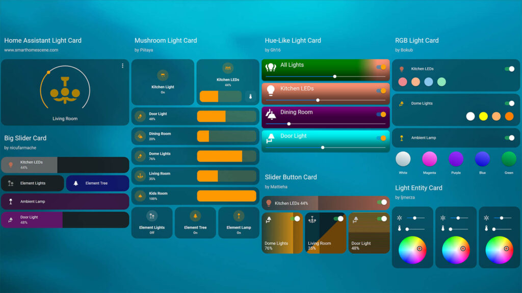
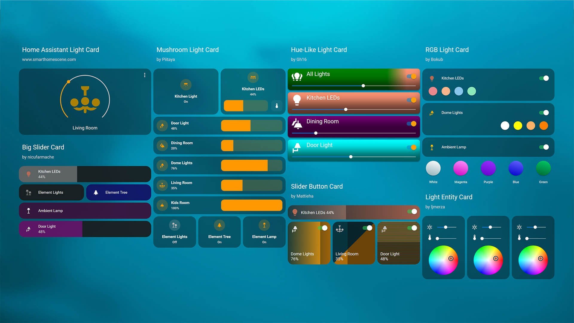
This article is showcasing a collection of the Best Home Assistant Light Cards available in the community store (HACS). Screenshots as well as configuration examples can be found under each card as well as direct download links. Previous articles of similar collections containing custom cards and themes:
- Best Home Assistant Dashboard Themes in 2023
- Another Top 10 Home Assistant Lovelace Themes
- Top 10 Home Assistant Lovelace Themes
- Top 8 Home Assistant Thermostat Cards
- Top 10 Home Assistant Weather Cards
All credit goes to the individual developers who made these awesome custom cards.
Links to their Github profiles will be left in the description, so you can support them with a cup of coffee if you want.
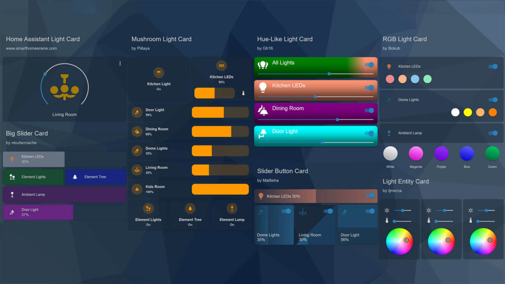
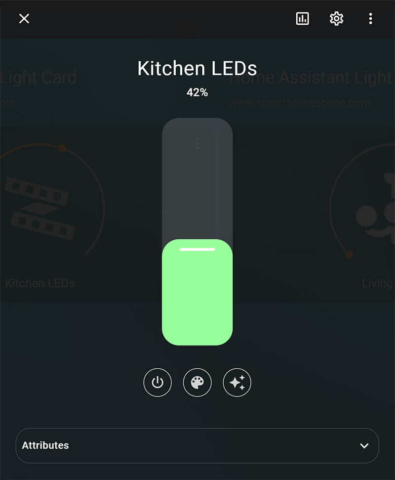
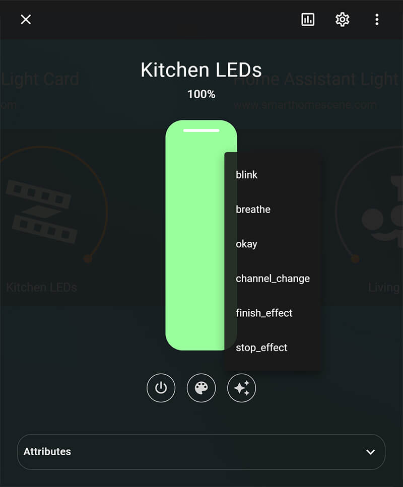
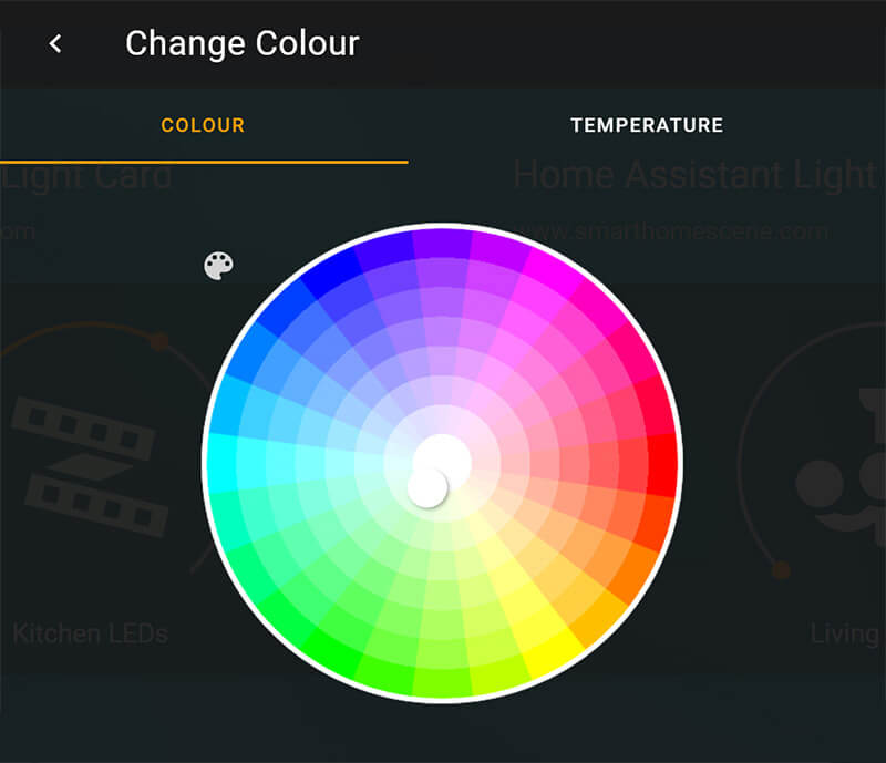
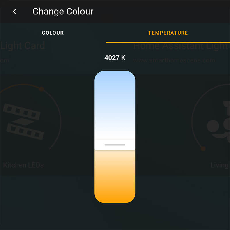
Home Assistant Light Card
The built-in Light Card in Home Assistant has been slowly maturing and becoming a solid light control card for many users, especially if you don’t need a lot of customization options. Recently, HA devs worked with piitaya, the developer of Mushroom Cards to create a custom pop-up dialog window for controlling lights.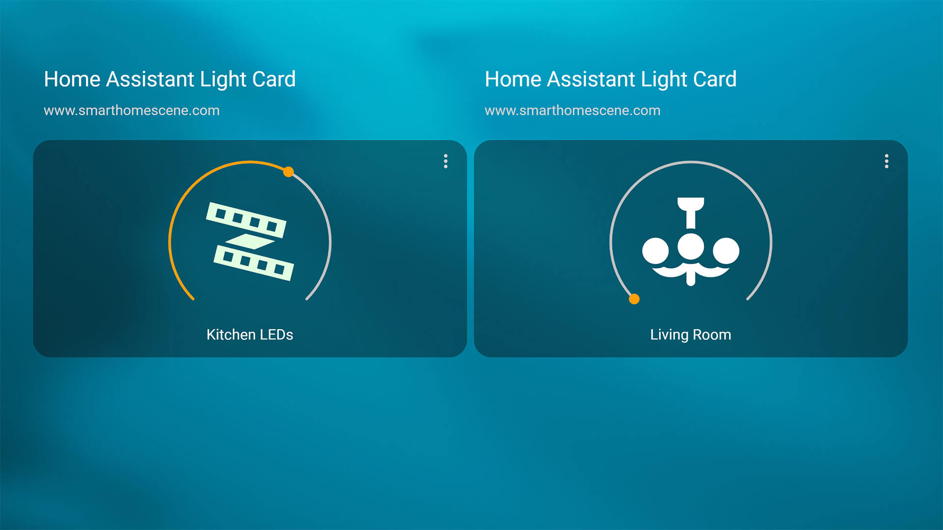
This card does not need to be downloaded, it’s part of any default Home Assistant installation. The pop-up dialog window will present you with a couple of options, depending if they are available for your light:
#Configuration Example
type: light
entity: light.kitchen_leds
name: Kitchen LEDs
icon: mdi:led-strip-variant
RGB Light Card
The RGB Light Card lets you define color and brightness presets for your lights, and display them in neatly designed circles underneath your light entity for quick toggling. This card is simply a line of clickable icons, and works best when added in an entities card. You can also use the icons to call scripts, scenes or any service call instead of changing color for the light.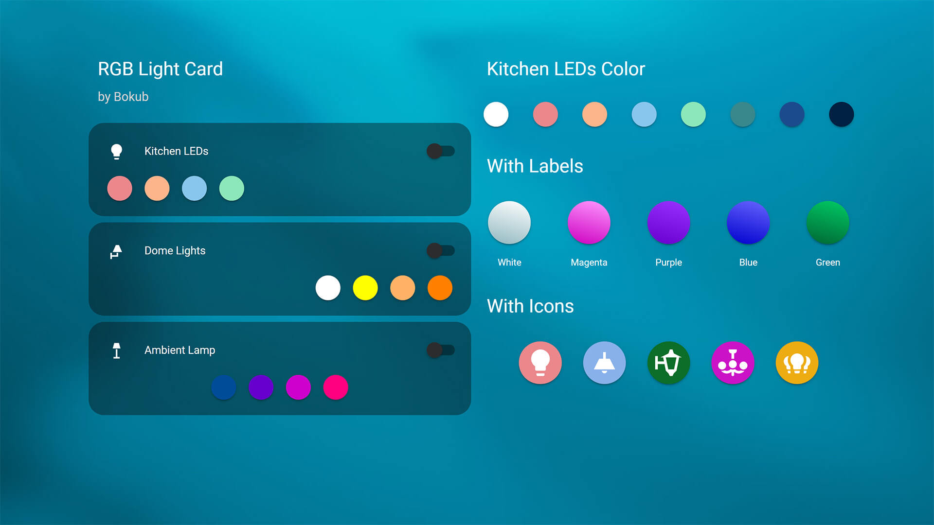
- Download:

- Name: RGB Light Card
- Repo: https://github.com/bokub/rgb-light-card
- Developer: bokub (Boris K)

This card offers a variety of customization options, you can change the size of the circles, add labels, icons and create gradient patterns. You can define custom service calls for the icon, so you can use them for anything else you can think of. You can convert material design icons to CSS icons by using the following tool and add the code under the icon_color variable. A few examples:
#RGB Light Card inside an Entities Card
type: entities
entities:
  - entity: light.kitchen_leds
  - type: custom:rgb-light-card
    entity: light.kitchen_leds
    colors:
      #Gradient Icon
      - rgb_color:
          - 234
          - 136
          - 140
        brightness: 255
        transition: 1
        icon_color: 'linear-gradient(15deg, #C0C0C0C0, #FFFFFF )'
      #Icon Inside the Circle
      - rgb_color:
          - 251
          - 180
          - 139
        brightness: 200
        transition: 1
        icon_color: >-
          center/75% no-repeat
          url("data:image/svg+xml,%3Csvg%20xmlns%3D%22http%3A%2F%2Fwww.w3.org%2F2000%2Fsvg%22%20id%3D%22mdi-lightbulb%22%20viewBox%3D%220%200%2024%2024%22%3E%3Cpath%20fill%3D%22%23FFFFFF%22%20d%3D%22M12%2C2A7%2C7%200%200%2C0%205%2C9C5%2C11.38%206.19%2C13.47%208%2C14.74V17A1%2C1%200%200%2C0%209%2C18H15A1%2C1%200%200%2C0%2016%2C17V14.74C17.81%2C13.47%2019%2C11.38%2019%2C9A7%2C7%200%200%2C0%2012%2C2M9%2C21A1%2C1%200%200%2C0%2010%2C22H14A1%2C1%200%200%2C0%2015%2C21V20H9V21Z%22%20%2F%3E%3C%2Fsvg%3E"),
          #EA888C
      - rgb_color:
          - 136
          - 198
          - 237
        brightness: 150
        transition: 1
#RGB Light Card With Services Calls
type: entities
entities:
- entity: light.kitchen_leds
- entity: light.dome_lights
- type: 'custom:rgb-light-card'
colors:
#Calling a Script
- type: call-service
service: script.turn_on
service_data:
entity_id: script.movie_mode
icon_color: '#90b2ec'
#Calling a Scene
- type: call-service
service: scene.turn_on
service_data:
entity_id: scene.bedtime
icon_color: '#f1a5cb'
#Send TTS Announcement
- type: call-service
service: notify.nest_living_room_speaker
service_data:
data:
type: tts
message: It's bedtime!
icon_color: '#77e28a'Hue-Like Light Card
The Hue-Like Light Card, like the name suggests, is inspired by the Phillips Hue app. It features a thin line slider at the bottom for quick brightness or temperature control. This custom card is highly customizable and has it’s own popup dialog window that you can tweak and adjust. It doesn’t feature a UI editor and can only be setup through YAML.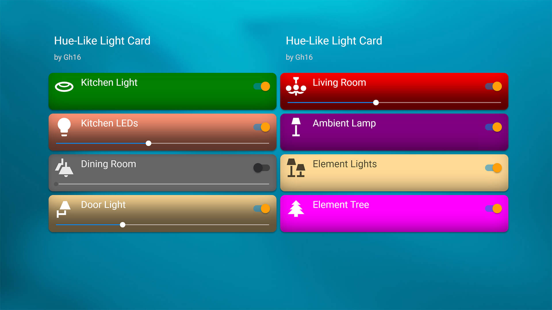
- Download:
- Name: Hue-Like Light Card
- Repo: https://github.com/Gh61/lovelace-hue-like-light-card
- Developer: Gh61 (Tomáš Zenker)
This Phillips Hue light card overs a plethora of customizability options, such as colors, icons, shadows, click actions and borders. The slider is automatically added if your light entity has a supported feature like brightness or temperature. What this card does best though, is that it has it’s own popup dialog window, called Hue Screen, in which you can list multiple entities for control. For example: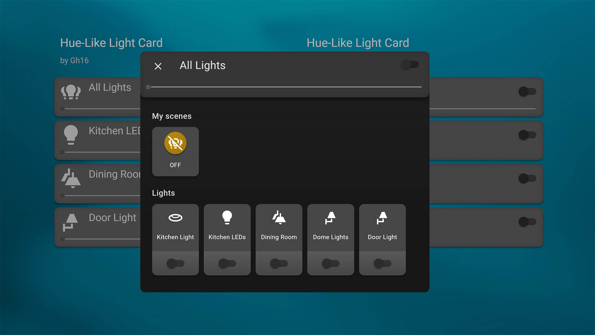
#Configuration Example
type: custom:hue-like-light-card
title: All Lights
entities:
  - light.kitchen
  - light.kitchen_leds
  - light.dining_room
  - light.dome_lights
  - light.door_light
This creates a popup with all entities listed as controllable lights, a master toggle at the top and a list of predefined scenes.
Light Entity Card
The custom Light Entity Card brings the color wheel and other controls directly on your dashboard, eliminating the popup window and additional clicks needed to change light color. This can be very handy if there are lights you use frequently and would like to quick toggle from the dashboard, however it’s quite large.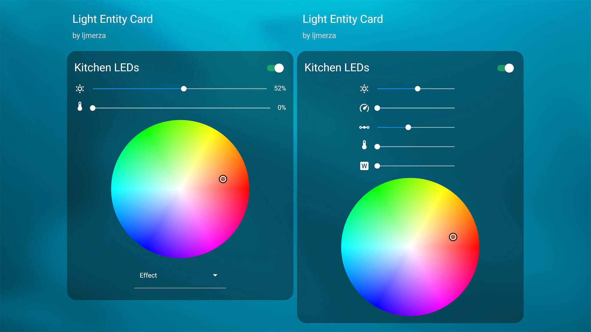
- Download:
- Name: Light Entity Card
- Repo: https://github.com/ljmerza/light-entity-card
- Developer: ljmerza (Leonardo Merza)
This custom card can also be edited through it’s built in user interface, so no need for YAML code. You simply check the option that you would like included to your light and save the card. 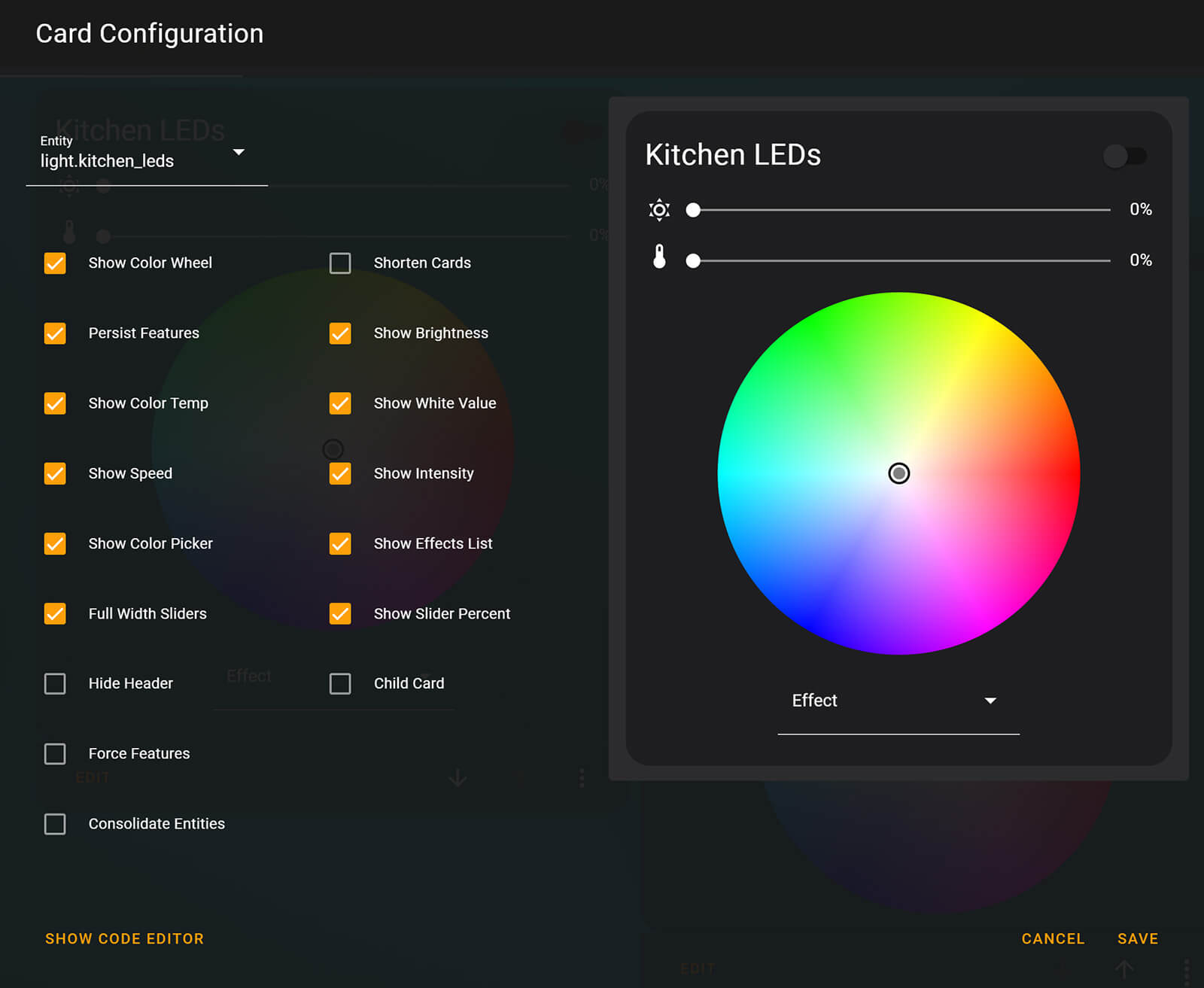
#Configuration Example
type: custom:light-entity-card
shorten_cards: false
consolidate_entities: false
child_card: false
hide_header: false
header: ''
color_wheel: true
persist_features: true
brightness: true
color_temp: true
white_value: true
color_picker: true
speed: true
intensity: true
force_features: false
show_slider_percent: true
full_width_sliders: true
brightness_icon: weather-sunny
white_icon: file-word-box
temperature_icon: thermometer
speed_icon: speedometer
intensity_icon: transit-connection-horizontal
entity: light.kitchen_leds
effects_list: true
Mushroom Light Card
The Mushroom Light Card looks best when used with other cards from the Mushroom Collection. You can learn how to create a minimalistic dashboard by using these card from our Mushroom Tutorials [Part 1, Part 2]. This custom card offers a few tweaking options and different layout, comes with a brightness, color and temperature sliders and can be configured exclusively through the user interface without YAML.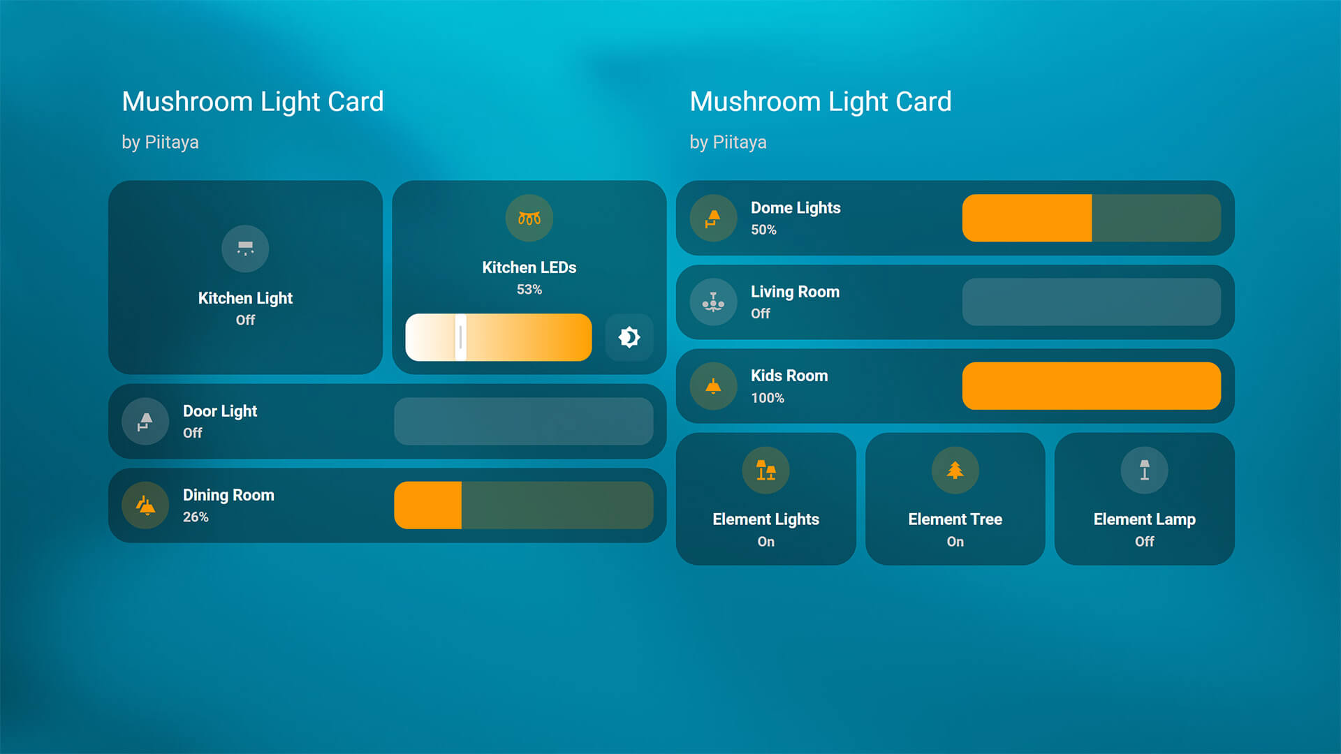
- Download:
- Name: Mushroom Light Card
- Repo: https://github.com/piitaya/lovelace-mushroom
- Developer: Piitaya (Paul Bottein)
Mushroom’s Light Card has three layout options available: default, horizontal, vertical and each one fills up different amount of space in your dashboard. When you combine multiple lights in a horizontal or vertical stack, you get a nice looking grid with all your lights. If you toggle the brightness, color or temperature sliders they are added to the card and you can control each one from the dashboard without a popup window.
YAML is not needed for configuring Mushroom cards, but here’s an example for reference:
#Configuration Example inside a vertical stack
type: vertical-stack
cards:
  - type: custom:mushroom-light-card
    entity: light.kitchen
    show_brightness_control: true
    fill_container: true
    icon: mdi:wall-sconce-flat
    layout: horizontal
  - type: custom:mushroom-light-card
    entity: light.kitchen_leds
    show_brightness_control: true
    icon: mdi:string-lights
    show_color_temp_control: true
    layout: vertical
If you are using Mushroom cards, I suggest also installing a fork made by dev phischdev called Mushroom Better Sliders available in HACS. It focuses on making the sliders more touch friendly:
- Sliders move on reduced speed when dragged by a finger (easier to hit small values)
- Sliders can be dragged from any point on the slider (like in iOS Home)
- Sliders apply live changes to your devices (except turning them off)
- Explicitly makes it easier to hit 1%
Slider Button Card
The Slider Button Card is a highly versatile and customizable custom card which can be used for many different kinds of entities. It works beautifully for controlling lights, as the full background of the card is a slider that you use to change brightness, color or temperature.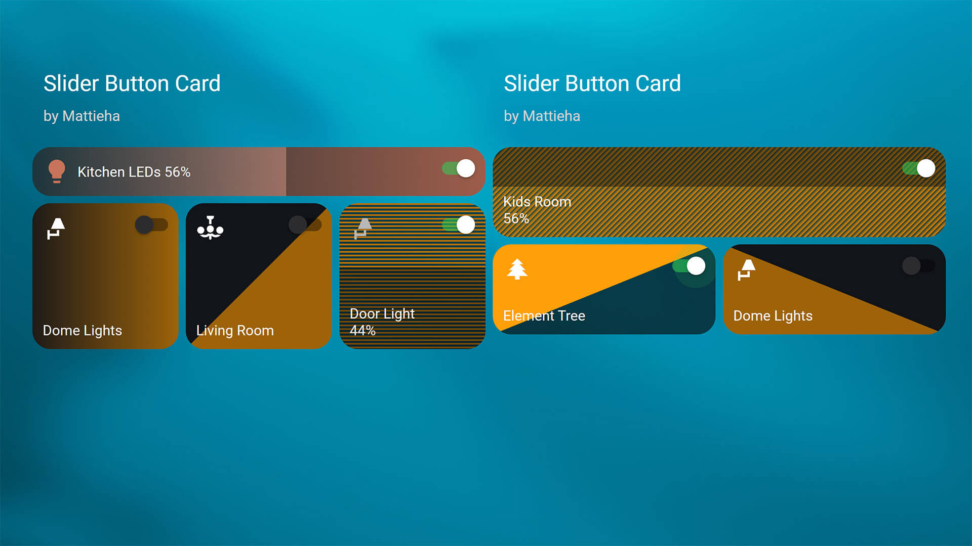
- Download:
- Name: Slide Button Card
- Repo: https://github.com/mattieha/slider-button-card
- Developer: mattieha
This card comes with a built in UI editor, although there are some things that can only be tweaked by editing it’s YAML code. It has an extensive documentation on it’s official repo as well as a bunch of examples that you can copy-paste and edit to fit your dashboard. The dev created a neat set of gifs to showcase the card, giving examples for lights, fans, media players, switches, covers, climate entities and locks.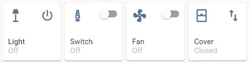
Source: https://github.com/mattieha/slider-button-card
#Configuration Example
type: custom:slider-button-card
entity: light.kitchen_leds
slider:
  direction: left-right
  background: gradient
  use_state_color: true
  use_percentage_bg_opacity: true
  show_track: false
  toggle_on_click: false
  force_square: false
show_name: true
show_state: true
compact: true
icon:
  show: true
  use_state_color: true
  tap_action:
    action: more-info
  icon: ''
action_button:
  mode: toggle
  icon: mdi:power
  show: true
  show_spinner: true
  tap_action:
    action: toggle
Big Slider Card
The final custom card on this list, called the Big Slider Card is extremely simple and suited to it’s name. It’s just a big horizontal slider used to control a light’s brightness. It can be customized to an extent, but it maintains it’s horizontal layout no matter what else you fine tune.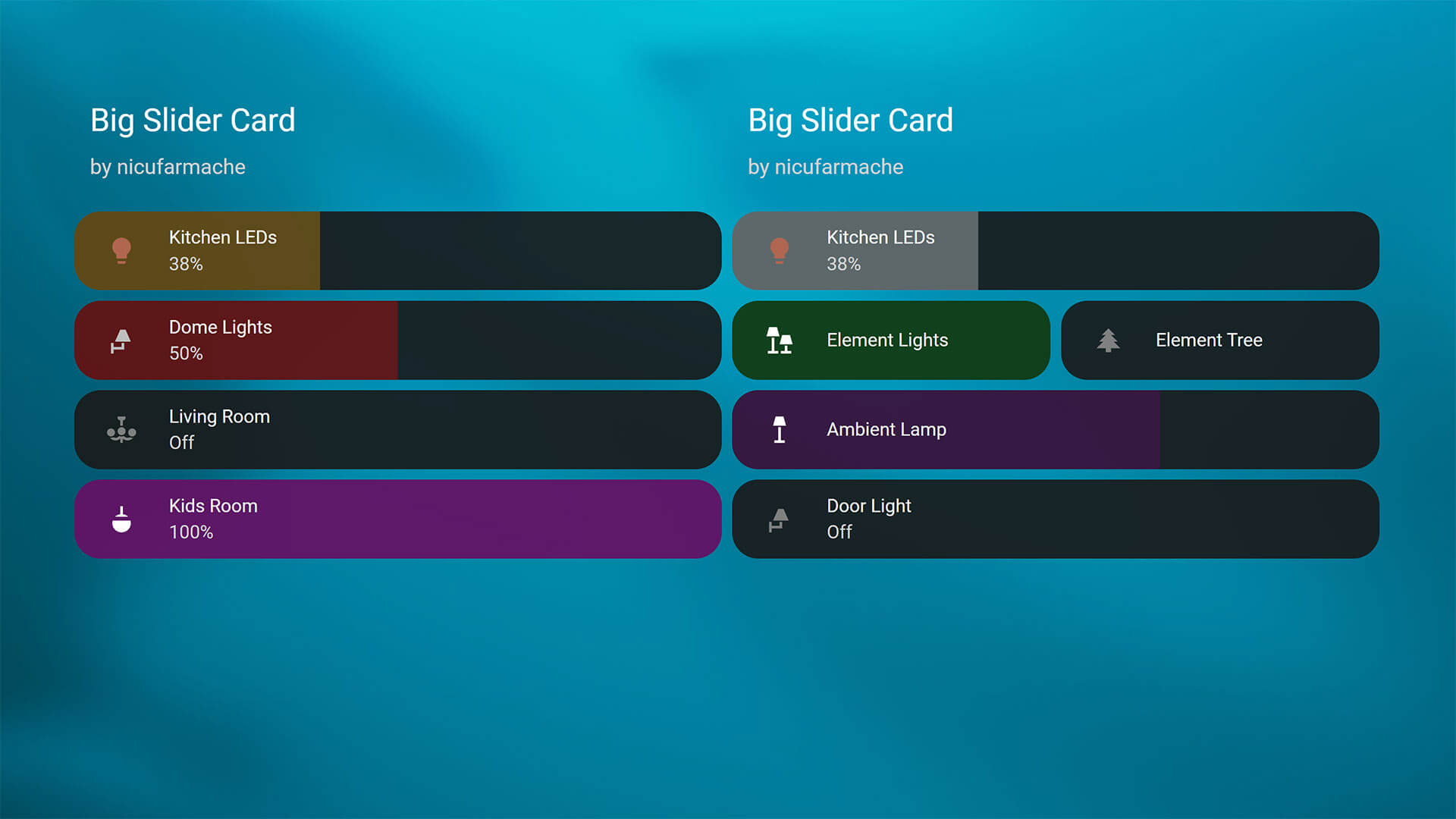
- Download:
- Name: Big Slider Card
- Repo: https://github.com/nicufarmache/lovelace-big-slider-card
- Developer: nicufarmache (Nicolae Farmache)
This one doesn’t have a built in UI editor, but it also has limited configuration variables so tweaking it in YAML should not be troublesome for most. It does allow you to change the slider response and feel, adjusting transition, min_slide_time, hold_time and settle_time. Here is an example of a couple of cards, stacked in a vertical stack:
#Configuration Example
type: vertical-stack
cards:
  - type: custom:big-slider-card
    entity: light.kitchen_leds
    color: orange
    show_percentage: true
  - type: custom:big-slider-card
    entity: light.dome_lights
    color: red
    show_percentage: true
  - type: custom:big-slider-card
    entity: light.living_room
    color: purple
    show_percentage: true
  - type: custom:big-slider-card
    entity: light.kids_room
    color: magenta
    show_percentage: true
    hold_time: 800
Screenshots